Icon testing guide
Icons are a pivotal part of a screen designer’s toolkit and a constant in the ever-changing landscape of the internet. Good icons are useful, natural, and dare we say it — iconic. However, one bad icon in your interface can derail your users and make things harder, not simpler. Testing your icons is a quick and easy process which helps you avoid this. In this guide, we’ll take a look at the attributes of a good icon, and how to measure, compare and diagnose issues with icons using Lyssna.
Icon testing guide
What is an icon?
Google's Material Design spec describes icons as quick, intuitive images to represent core ideas, capabilities, or topics. Icons are best at adding value when they are well recognized and improve the visual design and usability of a UI.
An icon should always make an interface simpler to use, rather than introduce more complexity. This is why testing your icons is central to the success of your design.
There are pitfalls to avoid though — using too many icons, or introducing icons that don’t mean anything to users will weigh a design down.
Why use an icon?
There are lots of reasons why a designer might use an icon in a design. Here are a few of the more common ones.
Reduce the learning curve for new users
Some icons are nearly universal, so are quickly understood by new users. Most users would correctly identify icons for functionality like ‘close’, ‘help’ and so on.
Save on screen space
Icons are sometimes more concise than text, so can be an economical use of screen space. However, this is a double-edged sword, as cramming too many icons into a design can drastically reduce usability and aesthetic appeal.
Microsoft Word 95 for MacOS — packed with delicious icons
Improve visual appeal
When used tastefully, icons can enhance the look and feel of a design. Well designed icons are simple, clear, and can scale up and down in size on different devices with ease.
Great for fingers and thumbs
Icons can be sized and positioned to be easy touch targets on mobile displays. The naturally round hitbox of a finger or thumb means that icons are an easy solution for interaction design problems on mobile devices.
Transcend text
Icons don’t need to be translated for international users, although cultural differences do exist. Internationalizing a site is much easier when the UI patterns are not text-heavy, as some languages, like German, can blow single words out past 15-20 characters. This is a headache when a design relies on text-heavy navigation devices like menus and text buttons.
What to watch out for when designing icons
That said, icons have issues to be aware of too. If a user can’t find, recognize, or understand what an icon means, then they’re a detractor from the design. There are often cultural issues, accessibility concerns, or platform nuances that don’t translate universally.
For instance, on a desktop or laptop computer, users can generally hover over icons with the mouse pointer and get a descriptive message, label, or status to help them comprehend the intent. Functionality like this is patchy on mobile devices, and long-pressing an icon often invokes an alternative action rather than showing a clue about the primary intent of the icon.
This is just one example of why testing your icons is a necessity.
How to test icons
Simply using icons isn’t an instant cure-all for interface design issues. There very few hard and fast rules with here, so testing your individual icons and use cases is a pivotal part of making sure your designs are working as intended.
The good news is that all icons have common attributes that contribute to their performance, which you can measure with tests on Lyssna. The results from these tests will give you a good idea of what you need to address in the design of your icons and UI as a whole.
Key icon attributes to test
Here’s a list of the key attributes that our tests aim to measure, with some questions that a user might ask of an interface like a file manager:
Is the icon findable?
First of all, a user has to be able to find the icon in your design.
How do I delete this file? Where's the delete button?
Both the navigation test and first click test are great for testing findability, which is critical to measure in-context. The rest of the interface is an important part of how a user finds an icon, so testing without it makes it hard to get accurate findability data.
Is the icon recognizable?
Second, a user has to be able to identify the form of the icon — be it a real-world object like a floppy disk, or a metaphorical device like an arrow or network node.
Is this icon a trash can or a cup of tea?
Is the icon comprehensible?
Next, a user must be able to interpret the functionality that the icon is shorthand for. Can the user easily determine what the icon actually does, rather than what it is?
Does a trash can mean that I’m deleting this forever? Or can I go back and recover it in the future?
Both recognizability and comprehensibility are pretty flexible, in that you can test them in a variety of ways:
A design survey gives you unstructured, free-text feedback from participants.
A five second test measures how memorable the icon is.
A preference test helps you discover the icon that participants tell you that they understand more readily than other options.
A first click or navigation test gives you a view of the icon’s overall performance.
A good icon is both easy to recognize and comprehend. For example, a 'delete’ icon often looks like a trash can, making it extremely easy to recognize, and it completes the function of putting an item in the trash, so users can easily comprehend what it will do.
On the other hand, a ‘save’ icon often looks like a floppy disk. Though this convention is quite widely understood, users born in the 21st century may have never seen a floppy disk before, so will need to be familiar with the convention in order to recognize and comprehend what the icon will do.
Is the icon aesthetically appealing?
Finally, it’s optimal if icons fit nicely into the design, and enhance the aesthetics rather than working against it.
This delete icon looks about 15 years old, do these people care about their design? Should I be using this product or should I find a newer one?
The aesthetic appeal of an icon is best tested via a preference test, as it heavily depends on the opinions and tastes of your participants.
Should you test icons in or out of context?
The terms “in-context” and “out of context” are frequently used when testing icons. Testing an icon “in-context” means that the icon is displayed during the test in the same way it would be in the finished design — with the rest of the website or app screen still present.
Displaying the icon in-context allows you to get a holistic view of the findability of the icon. The icon’s recognizability when styled, sized and positioned as it would be in the final system is also tested when you include the context.
If you test the icon “out of context”, then you’re showing the icon in isolation, usually on a white background. This allows you to gather information on the specific icon without any hints that may come from the rest of the interface or design. It’s useful when the purpose of your testing is to find the most aesthetically pleasing icons.
Whether you test in-context or out of context depends on what attributes you want to know about. If you want to know about your icon’s findability or recognizability, then in-context is best as these attributes are influenced heavily by the overall design of the screen.
However, if you’re only wanting to test for comprehensibility or aesthetic appeal, it might make sense to test out of context to focus the participant directly on your icon elements.
If you’re in doubt about this, test icons in-context. Icons will usually be seen by your users in-context, so measuring their performance in this way is a safe bet.
Putting iconography testing into practice
Let’s see all of this in action by testing some icons for real-life problems.
Starting simple – testing recognizability and aesthetic appeal
When used to test icons, a preference test is a quick way of measuring user opinion around what an icon means, and how it 'feels’ to them.
You can get a basic idea about the recognizability, comprehensibility, and aesthetic appeal of an icon by pitting it against similar icons, out of context, and asking the crowd to decide.
This is exactly what happened in the below test. The icon in question was the ‘share’ icon, for a blog post content template. Four variations of the ‘share’ icon were tested, with a clear winner:
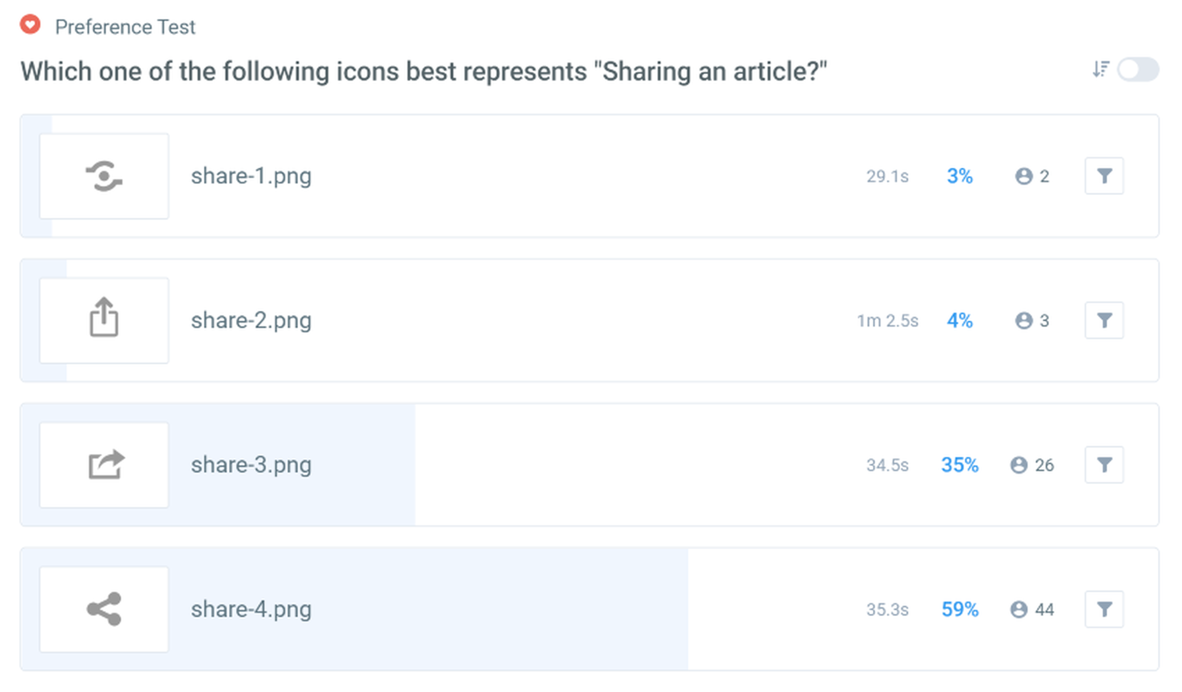
In this test, the functionality of the icon in question was spelled out to participants in the instructions:
Which one of the following icons best represents “Sharing an article”?
This means that this test aimed to measure participants’ opinions of the recognizability and aesthetic appeal of the icons, by providing a description of the functionality up front. This removes comprehension from the scope of the test.
If you want to test for specific attributes, as in this example, be clear in your instructions to participants so that they give you the right kind of data.
The issue with this type of testing is that you don’t get behavioral data at the end. Behavioral data is obtained when measuring how people act when presented with a situation, rather than what they say they would do. This is called attitudinal data.
When you’re testing icons that need to play well within an interface, you want a spread of both behavioral and attitudinal data. This is so that you get a good idea about the connection between what people consciously think about the icons, and how they use them in practice.
Good news! This is something that the Lyssna platform facilitates.
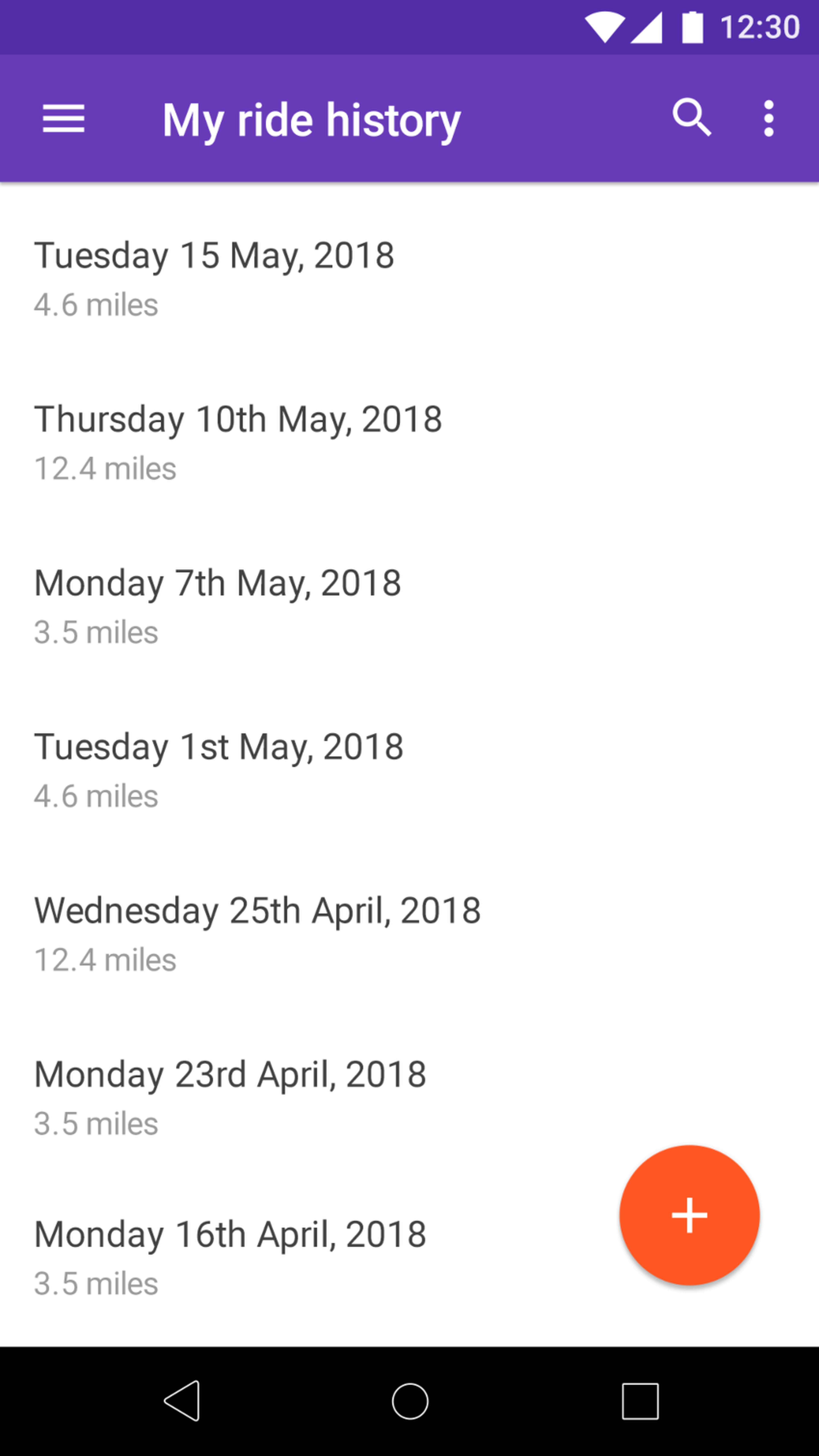
A more complex test – measuring icon performance in-context
In the below test, we wanted to see whether participants could find the options for a specific screen in a ride sharing/taxi app. This test was conducted in response to analytics that showed very little use of the functions within the ‘more’ icon on the right of the screen — the three vertically stacked dots.
This ‘more’ icon is a standard one from the Material Design icon set, so it’s a mystery why it is performing badly. If it’s a platform-wide standard for Android, why should these users find it difficult to use?
Here’s an excerpt from the results page that shows how often the success target area was clicked by participants:
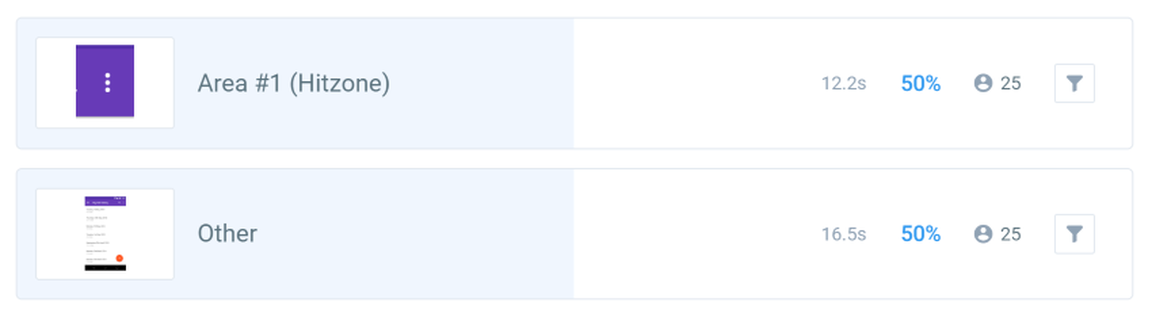
Baseline test results — ‘Area #1’ is the target
The results of this baseline test clearly highlight an area of opportunity for the design. A 50% split between success and failure is not a good result for a navigation test.
The right hand ‘more’ icon was the success target for this test, but half of the test participants went to the left-hand hamburger icon, which contains the primary navigation menu, not the page-specific one.
For a test like this to be successful, at least 80% of participants would hit the success target, so this design is a long way off. However, could the solution be as simple as switching the ‘more’ icon out for something different?
At first glance, it could be that the standard ‘menu’ hamburger icon on the left is taking attention away from the ‘more’ icon — or it’s not clear which of these menus contains the relevant options.
Get some quick alternatives together
Even though there is standardization in the Material Design guidelines around this ‘more’ icon, would a different icon do a better job for this use case?
The easiest way to find out with UI functions like this is to run a couple of first click tests. Grab your design tools and whip up a few concepts which show alternatives for the icon.
It’s critical that you don’t spend a lot of time doing this. These designs don’t need to be perfect. Test as many as you can. It’s not worth spending a lot of time agonizing over these concepts, because you’re using them to generate data for your design, not as a source of final validation and blessing on the design. They’re part of your work-in-progress.
The test is aimed specifically at changing this single icon, so we should create a variation set to contain all of our alternatives. This avoids corrupting our tests with participants that have prior knowledge of this design.
Let’s try a horizontal variation of the current icon design that looks like an ellipse, a variation with a traditional ‘settings cog’ icon swapped in, and a final variation with a text-only label to see if that makes a difference.
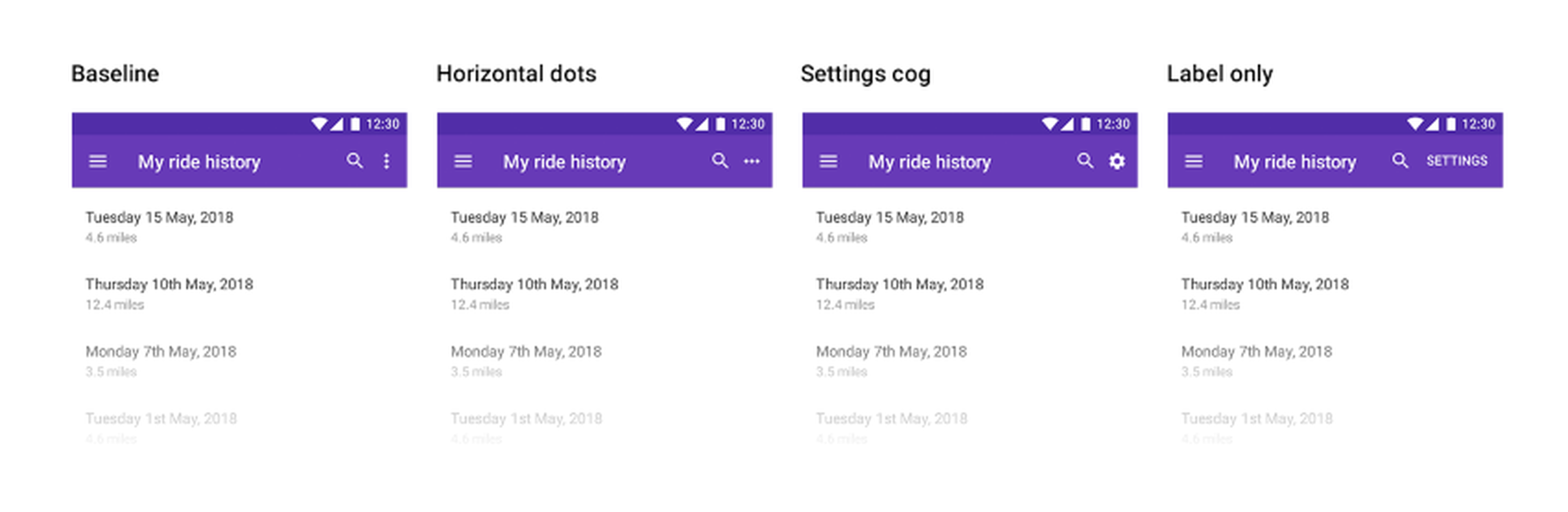
Variations of the ‘more’ icon, in-context
Those with a keen eye and knowledge of Material Design will note that this label-only option contravenes their guidelines. It also looks a bit cluttered and confused, with the hamburger icon, page heading, search icon, and test label.
That’s alright for the moment. When we’re trying to find a solution to a problem this severe, it doesn’t matter what the starting point is. It’s more important to start going down the right path as quickly as possible.
If the bare label works much better than the icons, we have a new direction to explore in the design that we know strikes a chord with participants.
The main point is to not get too attached to the solution at this stage. Think of this process as ideation facilitated by data, rather than traditional design spitballing.
Comparing the results
So which of the concepts worked the best?
When comparing multiple tests, it’s useful to extract the relevant results into a spreadsheet, so that you can see all of the critical data points together.
Here’s a chart showing the relevant results from the four completed tests:
These results show that none of the variations hit the mark. Even the best alternative, the horizontal dots, performs roughly the same as the baseline vertical dots.
If the best alternative was 10% better, then it’d be worth considering further, but a 2% increase isn’t enough to call it a success with a sample size of 50 participants, especially when the clicks on the ‘menu’ icon went up to 38% for this alternative.
It seems like the ‘menu’ icon is too overpowering for any of the options to work. This is having a negative impact on the findability of the target icon.
Interestingly, the text label option performs worst of all the variations, so let’s put this direction aside for now.
Testing the theory
Now that we’ve tested some alternative icons with no success, and suspect that the findability of the ‘more’ icon is suffering due to the ‘menu’ icon on the left, the next step is to try a version without the ‘menu’ icon to see what impact this has.
Again, don’t worry about the overall design when looking to test this kind of variation. The overall usability of the screen is not what we’re trying to test — we’re looking to isolate and test the problem with the ‘more’ icon only.
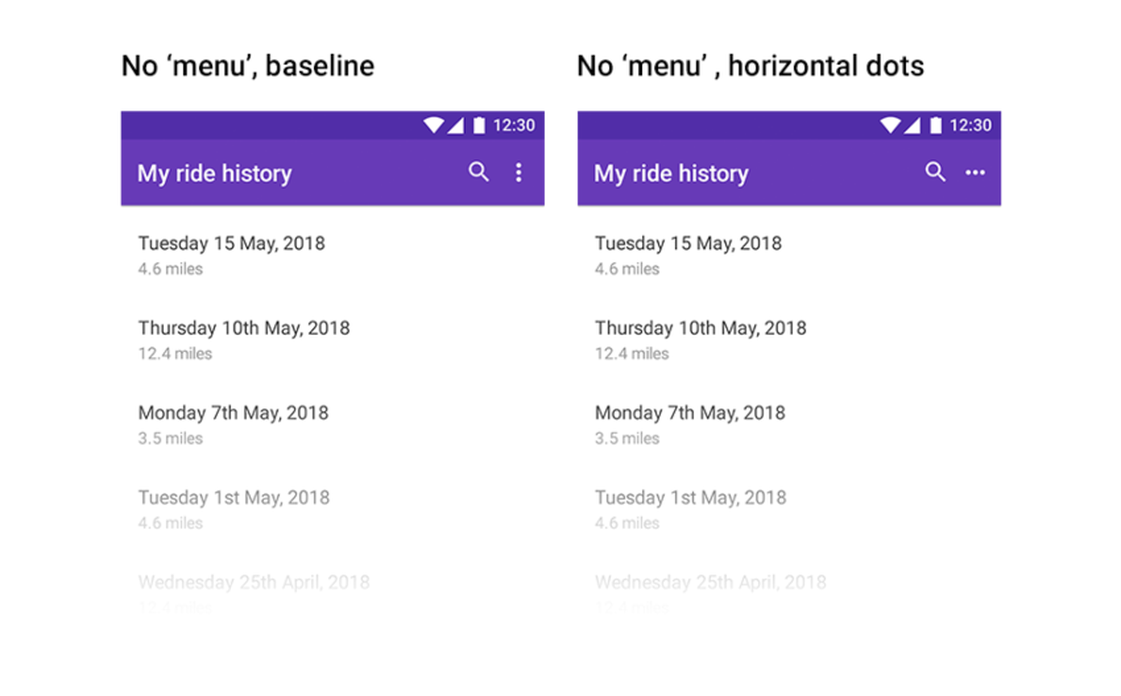
The second batch of variations, with no ‘menu’ icon
…and here is a comparison of the original test results with the new tests of the ‘more’ icon:
The results are clear — the current ‘more’ icon is fine. Rather, it’s other parts of the design that are causing issues.
In this example, having both a ‘menu’ and a ‘more’ icon on the screen is drastically degrading the icon’s findability, and perhaps the recognizability as well.
Better icons for all
In the examples above, we’ve scratched the surface of what can be found with a few simple tests that didn’t take a lot of time and money to complete — for the ‘more’ icon tests, we ended up with responses from 300 participants in total, at a cost of 300 credits and an afternoon of experimentation and testing. Sometimes it can feel like you’re going down a rabbit hole, but that’s all part of the design and research process.
Testing icons is a critical process for any product that uses them, and the insights you gain are always useful in building up a better picture of your end users. In turn, this helps you make better design decisions for your product.