01 Nov 2023
|10 min
App design trends
Learn about the latest app design trends of 2023, from conversational design to neobrutalism, and explore what’s in store for the future.


App design trends: 2023 so far, and what’s to come
If you could travel back in time just five years and tell yourself that AI and AR would become increasingly common in our daily lives within a mere half decade, would you believe it?
The first half of 2023 has shown us that tech companies are investing heavily in AI and, on top of that, Apple made its biggest announcement in years at WWDC23 with its VisionPro headset (and accompanying VisionOS).
What does this mean? With the increasing adoption and advancement of these technologies, the way in which we use devices that employ them changes – and UX design must adapt to innovate and keep customers happy.
In this guide, we’ll cover some of the trends that have started to become established and explore those that are still emerging, as well as make some future predictions.
1. Conversational design
With all the advancements in AI tech, it’s no surprise that conversational design is on this list. You can think of conversational design in two ways:
Using AI assistants within an app, either as a support feature or as the app’s main feature.
The practice of making interfaces more human-centered, using human conversation as a model for interactions within the app.
With AI conversations, dozens of apps are now cropping up on the marketplace that either use OpenAI or another large multimodal model. One example is AutoLang, a language learning app I signed up to review while it’s in beta testing.

This app uses conversational AI to help language learners improve their use of a target language (in my case, Spanish). These types of apps or AI-based interactions (e.g. Snapchat’s release of “My AI”) are becoming more popular as the general public start seeing great personal use cases for it – for example, 48% of US adults are interested in using AI-driven products for recipes, roadside assistance, and more.
Conversational AI can also be used to gather information from users to assist signup or onboarding flows. Mental health app Mindstep is a great example of this. After you sign up, most interactions are tap or video-based, but I imagine check-ins will also use a similar conversational model.

This type of conversational interaction is a super helpful way to gather lots of information from your users without making them feel overwhelmed by having to fill in the equivalent amount in text boxes.
2. Neobrutalism
For many years, the prevailing wisdom in design was "the simpler, the better,” with minimalism being the dominant design choice. While this is still true regarding functionality, it’s becoming less so for the visual design of apps.
Neobrutalism is defined by its use of bold colors, unusual shapes, and unique typography. It’s a callback to block, brutalist architecture of the mid-twentieth century but with a modern twist.
“There are a few trends I've noticed both from using other apps and through conducting user interviews to better understand what we can do to improve Plainly. While in previous years, clarity and minimalism were appreciated, users now want a more engaging experience and visually vibrant apps. This might include expressive imagery or experimental typography.” —Nebojsa Savicic, Co-founder of Plainly
An excellent example of neobrutalist design is the ecommerce platform Gumroad.
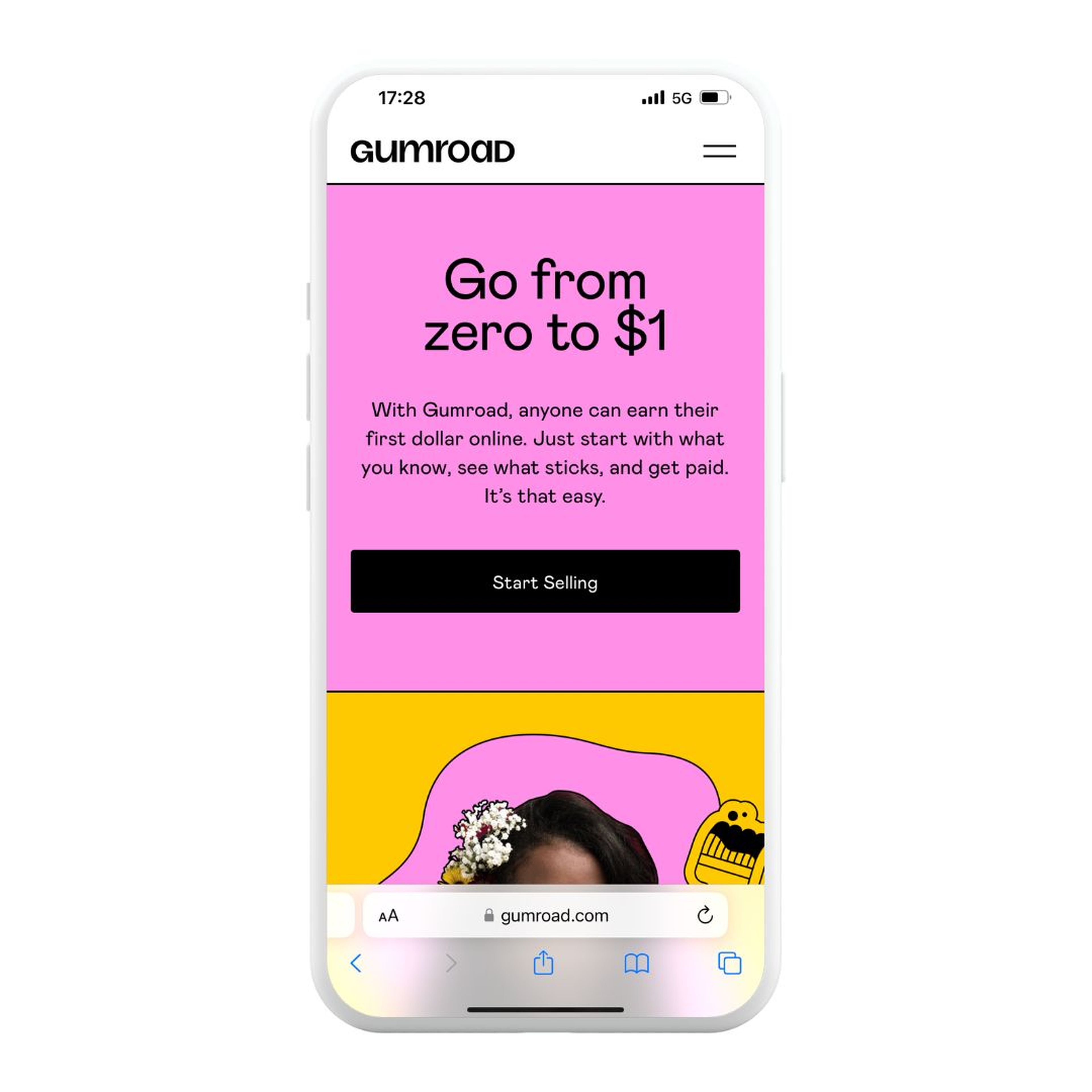
Notice the use of defined color blocks and sharp lines, as well as the logo itself. While the image in this example is taken from a mobile browser, Gumroad has a mobile app following the same brand style, but it’s only for sellers.
Neobrutalist design is a bold visual choice, so before going down this path it’s important to ask yourself whether this style matches your brand and what your audience expects from you.
3. Edgy typography
Few brands can get away with switching up their style to something as bold as neobrutalism (unless it was close already). However, another popular method of keeping things fresh is adjusting the typography of your brand – and following the shift toward neobrutalism, edgy fonts are in.
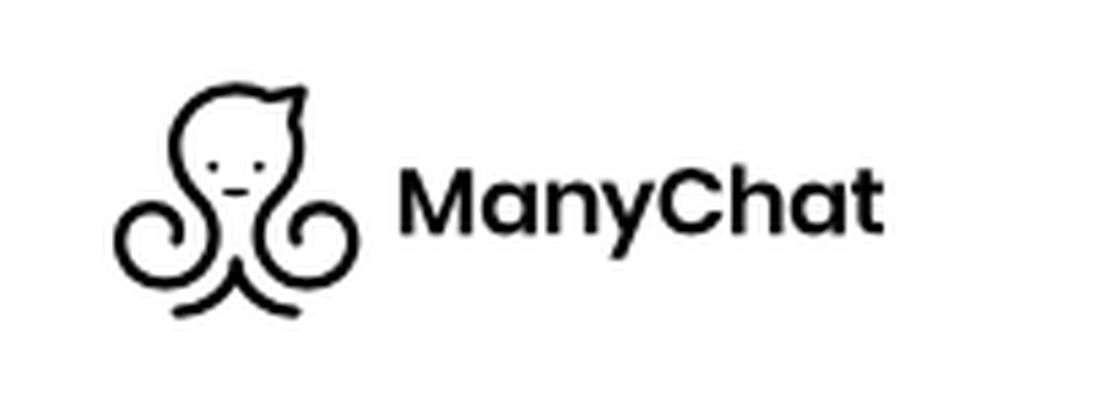
An example of this shift I came across was ManyChat, an automated chatbot building software whose logo and general typography used to look like this:
But now looks like this:
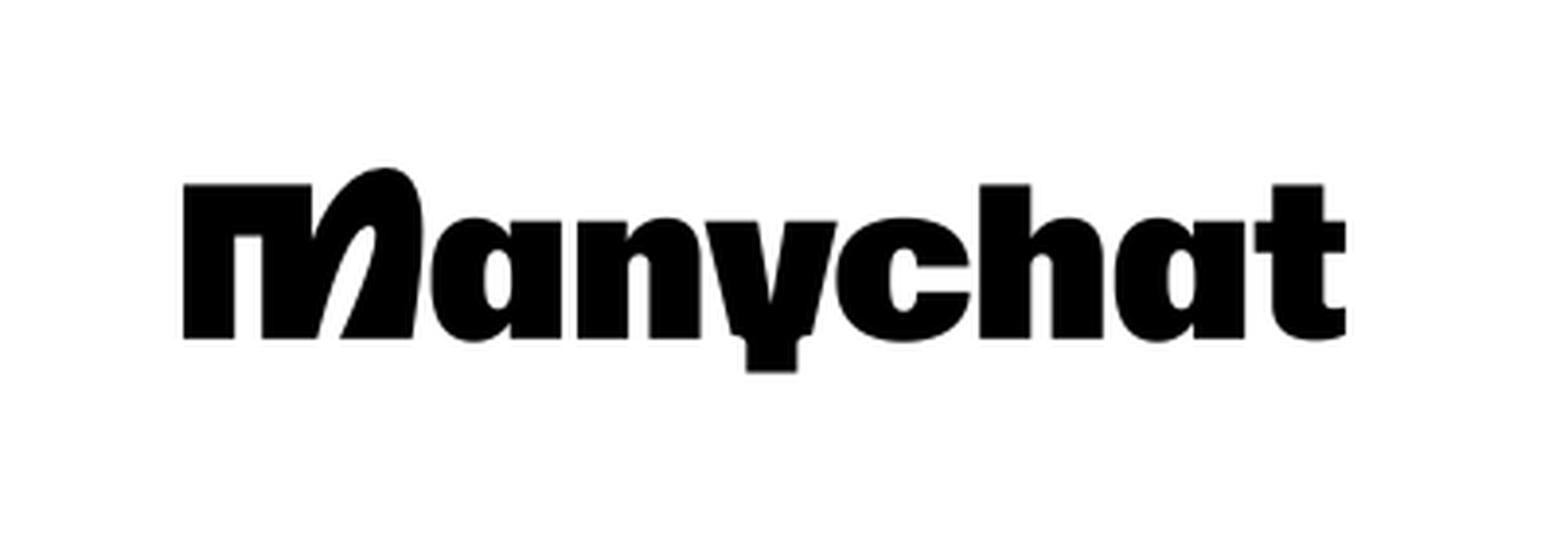
ManyChat injected personality and uniqueness into its brand aesthetics but, importantly, the visual changes are arguably a closer match to its target audience (social media managers/small business owners).
A mobile app example that uses unique, edgy typography is The Body Coach by Joe Wicks Workouts.
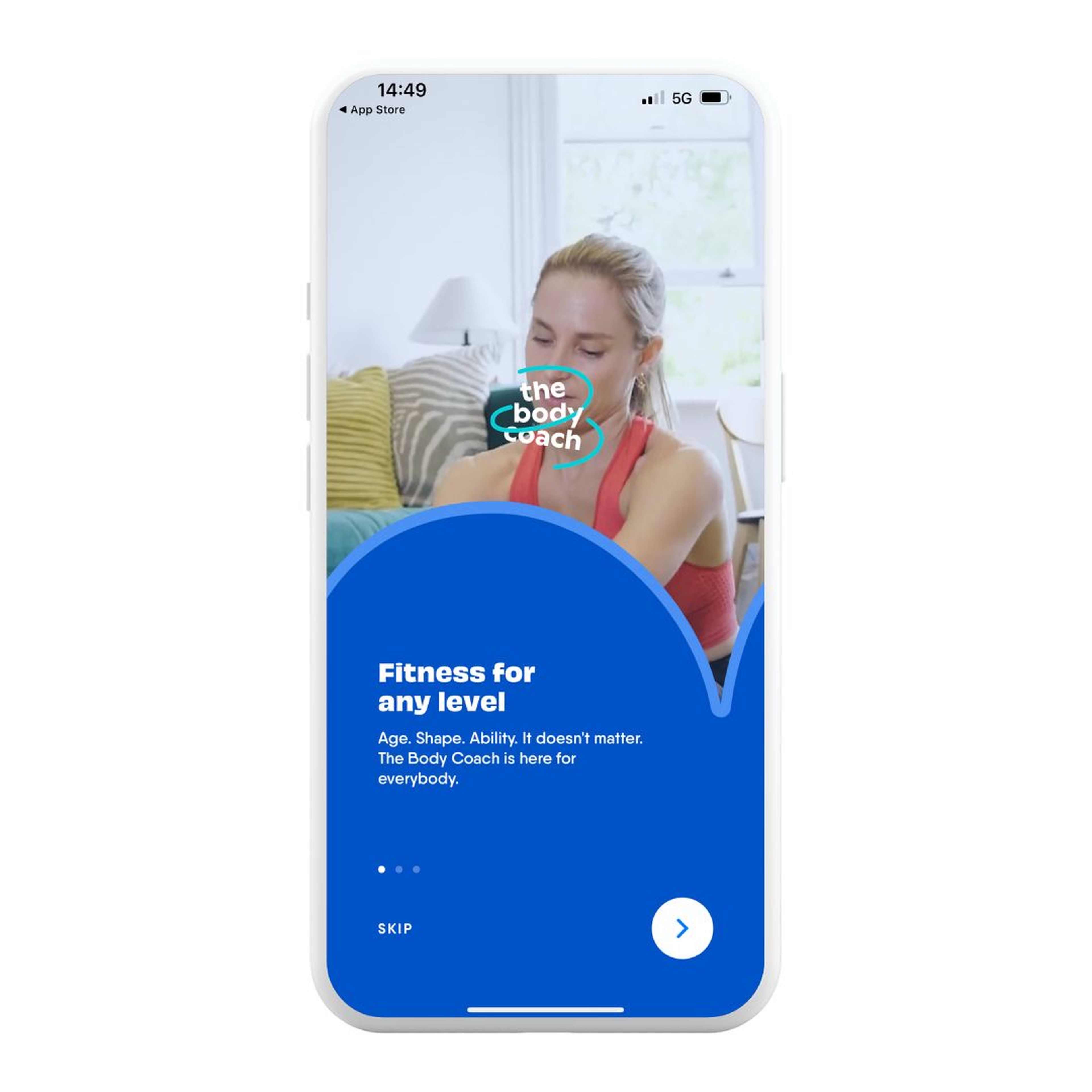
This edgy typography is great for introducing a feeling of informality, which in health and fitness apps can be more appealing to a beginner target audience.
To help your brand stand out from the competition, using a non-standard font (with some edge) brings out more personality and makes it easier for customers to remember you.
4. Micro-interactions
Another interesting trend that’s gaining more popularity in 2023 is the use of micro-interactions. I’ve noticed this trend in the apps I use, particularly when it comes to haptic feedback.
For context, I use a recent iPhone and have observed certain apps incorporating subtle haptic feedback to confirm task completion. Busuu, another language learning app I use, is one example of this. When I pass a language question, a slight vibration confirms my success and moves me to the next question, as well as showing animated feedback at the bottom of the screen.

“We’ve seen a rise in micro interactions that provide immediate feedback – things like tap states, audible success pings, and confirmation animations. They help give the user immediate clarity that they’ve completed a task or interaction successfully, and they encourage a tiny burst of positive emotional feeling. When used well, they can add micro points of positive reinforcement, but it’s important that they don’t become annoying.” — Andy Wilby, Head of Experience Design at RotaCloud
As Andy mentions, these small interactions help to create positive reinforcement while using the app, which lends itself to creating a more enjoyable user experience.
5. More emojis
Let’s revisit the idea that some informality can help users feel more at ease and willing to engage. Some mobile app designers and developers are doing this with typography – others are doing it by using more emojis.
While not everyone finds emojis appealing, there’s no denying they’ve grown in popularity over recent years – using data from the Unicode Consortium and Emojipedia, Statista charted the number of emojis by year, and notable emojis from 1995 to 2023, estimating this to sit at 3491 emojis in 2023.
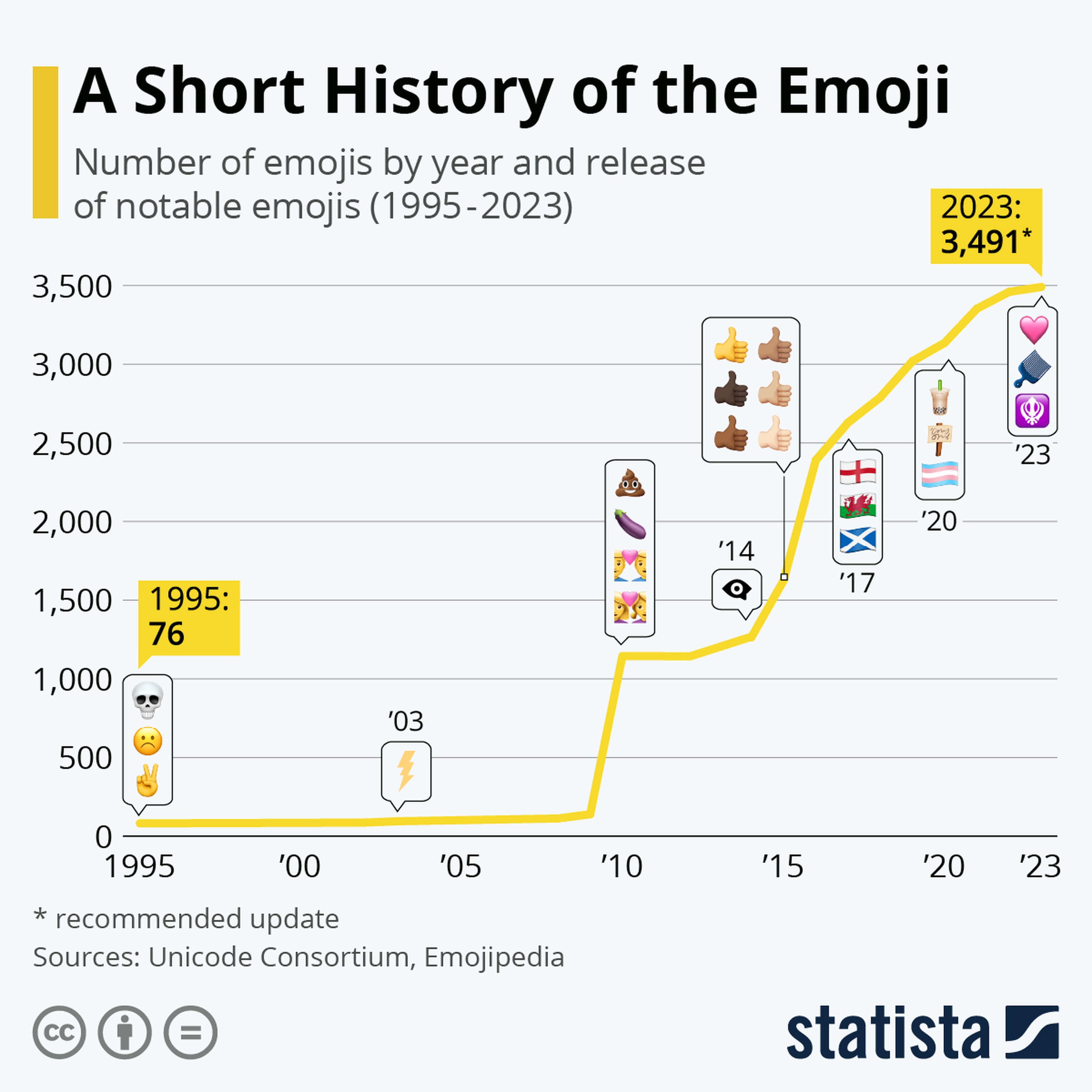
Image source: Statista
An example of a mobile app actively making this choice of “more emojis” is Mindstep, which I mentioned above.
Given the app is in the health and wellness niche, built by doctors, users might expect a stuffy, clinical experience. Instead, it greets you with a health quiz. Once completed, there are a few tabs at the bottom, including the results screen, which contains a bunch of emojis.
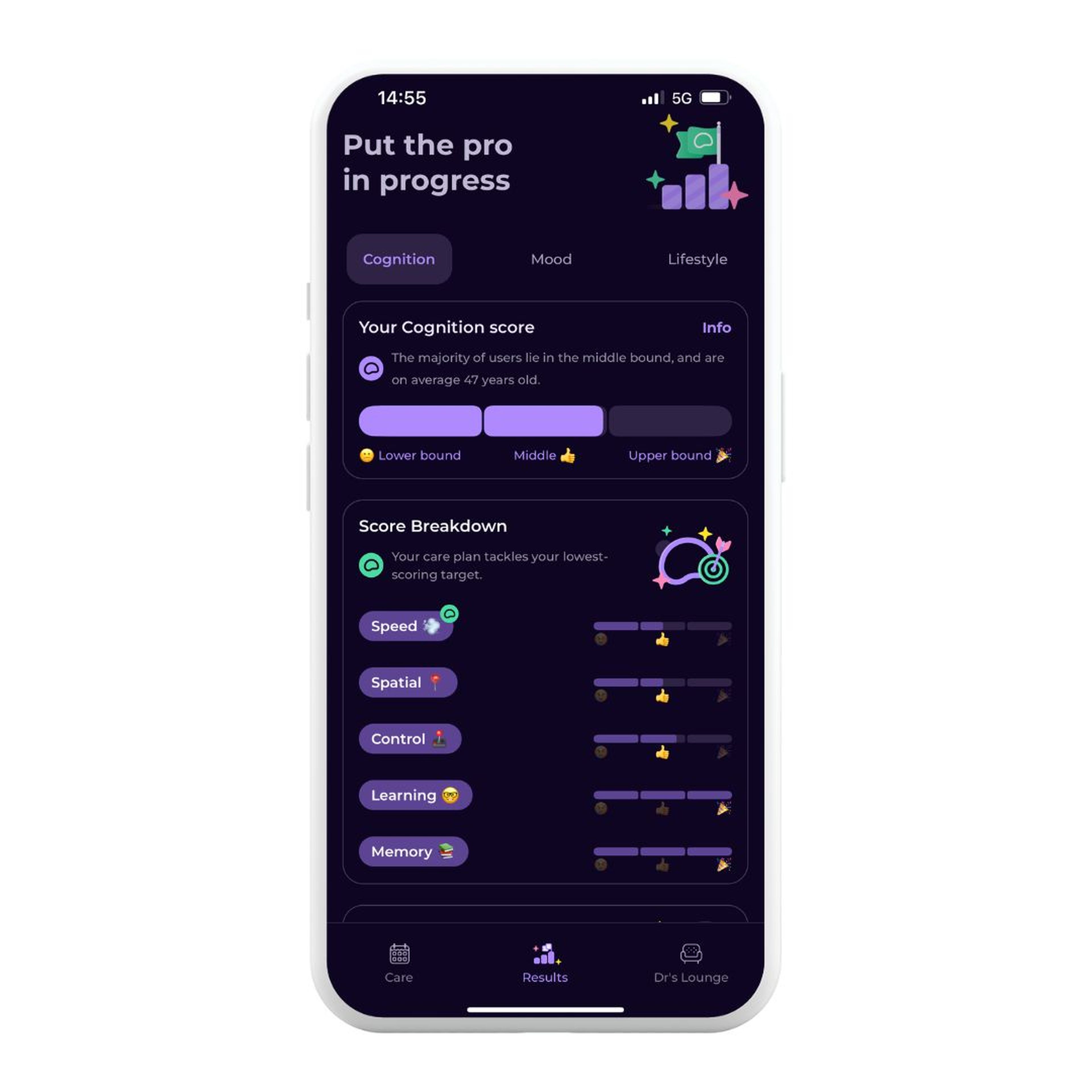
Other than helping the user create a visual association between words and their meanings, emojis used in this way allows users to interact with apps in a language that’s familiar to them. This can be especially helpful in niches or industries prone to jargon.
6. Integrated product education
It’s easy to think that our UX design and research process was so thorough that future users will know exactly how to use our app. TL;DR: often, they don’t. I’ve used plenty of apps that don’t have clear instructions or that relegate information to the FAQs.
However, as my mother always told me growing up, “When you assume, you make an ass out of u and me.” These are wise words that have helped me greatly and can help you if you embrace the trend for integrated product education.
Having education integrated into your app means your users will better understand your product and are more likely to be successful using it.
Andy Wilby commented on this rising trend:
“We sometimes take for granted that users can use an app immediately and know exactly what they need to do. But with the introduction of Apple’s new TipKit, I think apps will start to incorporate a lot more product education to ensure that users receive a much more engaging experience and get the most of the features – especially as expectation continually increases from users over what an app should allow them to do, and apps as a response become more and more complex and feature-rich.”
I recently downloaded an app called Habit (a habit-tracking app) and noticed that it integrates product education into the experience.
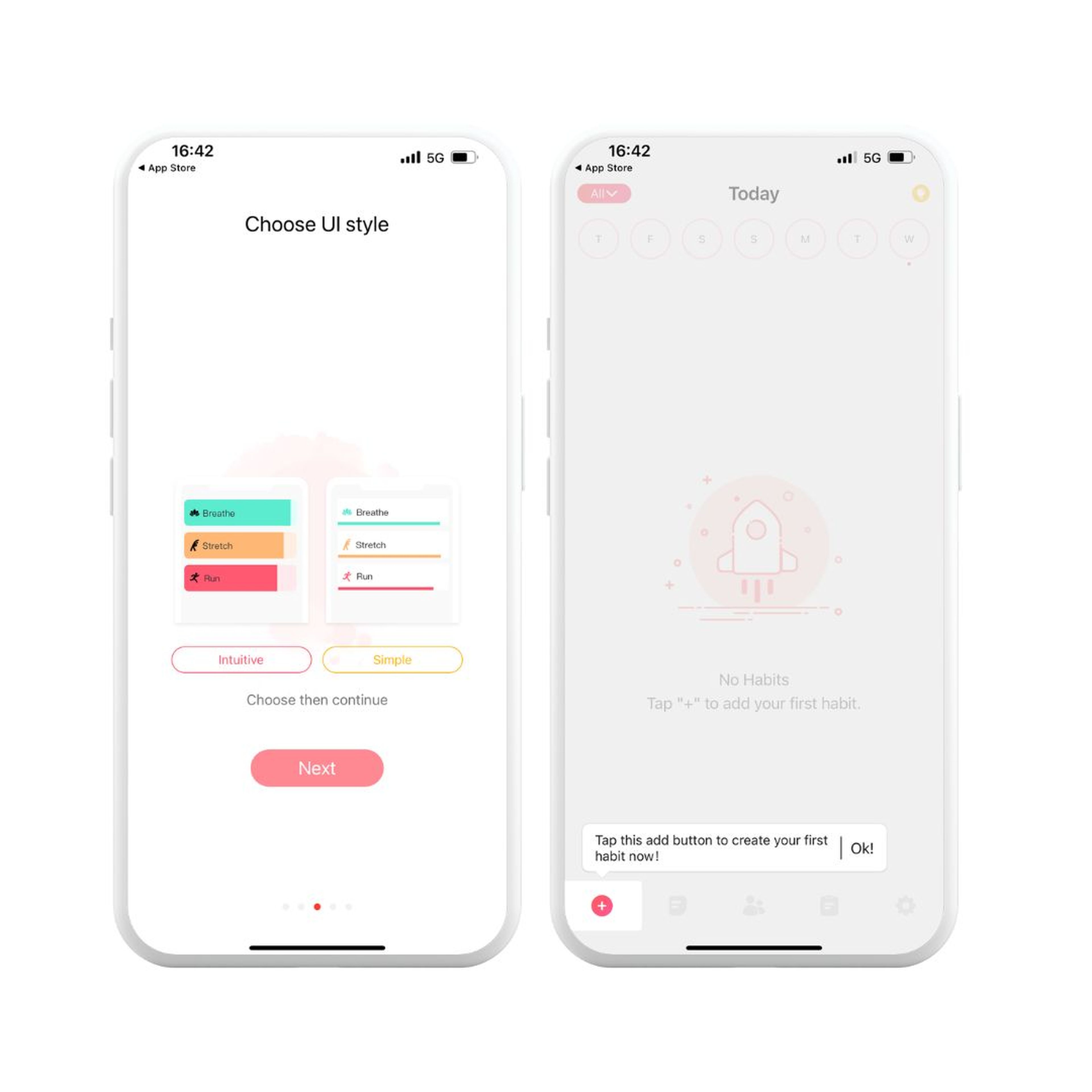
Upon downloading the app, you notice that – despite its relatively simple interface – you’re promptly greeted with a brief tutorial on how to use the app effectively, along with some helpful tips for maximizing its features.
7. Bonus prediction: AR will become more popular
Augmented reality (AR) has struggled a little to become as widely adopted as virtual reality.
It’s been helped along so far by social media filters (such as Snapchat and Instagram), as well as the useful application in shopping for large homeware items on Amazon. But according to Statista Market Insights, AR is still in its infancy. That’s likely to change in 2024 with Apple’s announcement of VisionPro (which, given its portability, could technically be a mobile device). Apple has a history of creating a market where there wasn’t one, or little of one, for example when the Apple Watch skyrocketed smartwatch adoption.
With Apple’s release of a dedicated AR device, chances are that widespread adoption of AR will follow.
Exploring trending designs for your app? Test and validate with Lyssna
Changing an existing app is inherently risky. What if your user base doesn’t like the changes? What if you accidentally exclude a portion of your users and make changes that affect accessibility? Trends can fizzle out as quickly as they sparked up, making it challenging to discern between what’s popular now versus what will stick around.
If you’re looking to implement changes or make enhancements to your app, you should always test with your users first. With Lyssna, you can use a variety of research methods, like prototype testing and preference testing, to test the design and functionality of your app before going live.
Elevate your research practice
Join over 320,000+ marketers, designers, researchers, and product leaders who use Lyssna to make data-driven decisions.

--
Alexander Boswell is a freelance writer specialising in Alexander Boswell is the Founder/Director of SaaSOCIATE, a B2B SaaS, MarTech and eCommerce Content Marketing Service and a Business PhD candidate. When he’s not writing, he’s playing baseball and D&D.
You may also like these articles


Sign up to our newsletter
We'll keep you updated with the latest UX insights and more.