01 Nov 2023
|15 min
Analyzing test results in Lyssna
Learn how to analyze your Lyssna test results and discover how this data can shape the future of your product.

Testing is a crucial component of the design and product development process, but analyzing and interpreting your test results data is what truly drives improvement.
Whether you're just starting out or you're a seasoned UX designer or researcher, understanding how to extract meaningful insights from your test results is key to making informed decisions and delivering exceptional user experiences.
In this article, we share the tools you can use to turn your Lyssna test results into actionable insights.
Report and analysis features in Lyssna
In this section, we'll guide you through the different test types available in Lyssna and explain their associated results and analysis features. Knowing the purpose of each test type and how to interpret the results is essential for getting the most out of your tests.
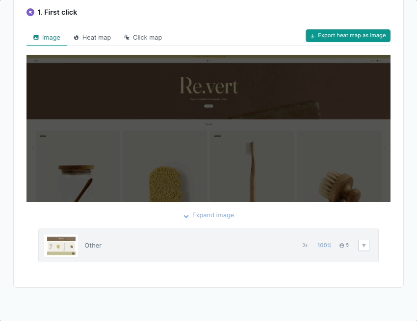
First click test results
First click tests provide insights into user interactions, navigation challenges, and overall user experience. In Lyssna, this type of test offers four key report styles – heatmaps, click maps, click cluster analysis, and task completion time.
Heatmaps
Heatmaps visualize a user's interactions with your website or application, highlighting areas of interest and activity.
For instance, say you conduct a first click test for an ecommerce site, asking users to find a particular product. After analyzing the heatmap results, you find that users are clicking in different locations, prompting your team to enhance the visibility of product findability.
Pro tip: You can select regions of the design to see the total number of clicks and average click times within that highlight. You can also filter to show only the clicks you want to see.
Click maps
Click maps provide a visual representation of user click patterns, helping to identify areas of interest or confusion.
Let's say you conduct a first click test to evaluate the effectiveness of your product's pricing page. You instruct participants to find detailed pricing information by clicking on elements they believe will lead them to the pricing details. The click map analysis from this test reveals a common user behavior where participants frequently click on non-clickable elements while completing the task, such as images or text without hyperlinks. This prompts you to revise the page design and make clickable elements more prominent, improving user engagement and click-through rates.
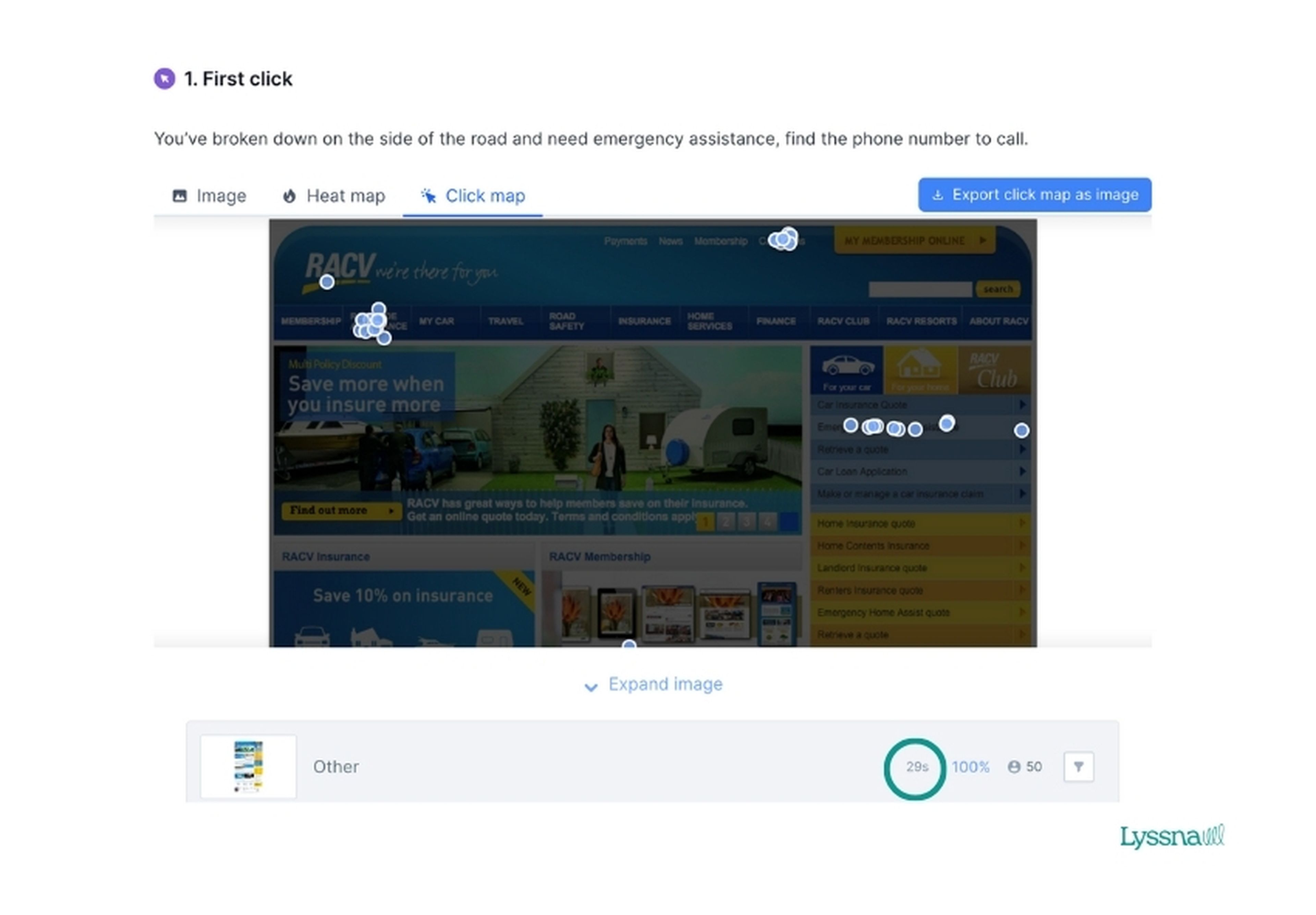
Click cluster analysis
Click cluster analysis identifies a collection of user click interactions, helping to identify common patterns or trends.
As an example, say you work for a roadside assistance company. You decide to run a first click test to assess the discoverability of your emergency assistance services. Click cluster analysis shows that users have three key areas where they think they’ll find this service, indicating that the messaging and placement of the service may not be as clear as desired.
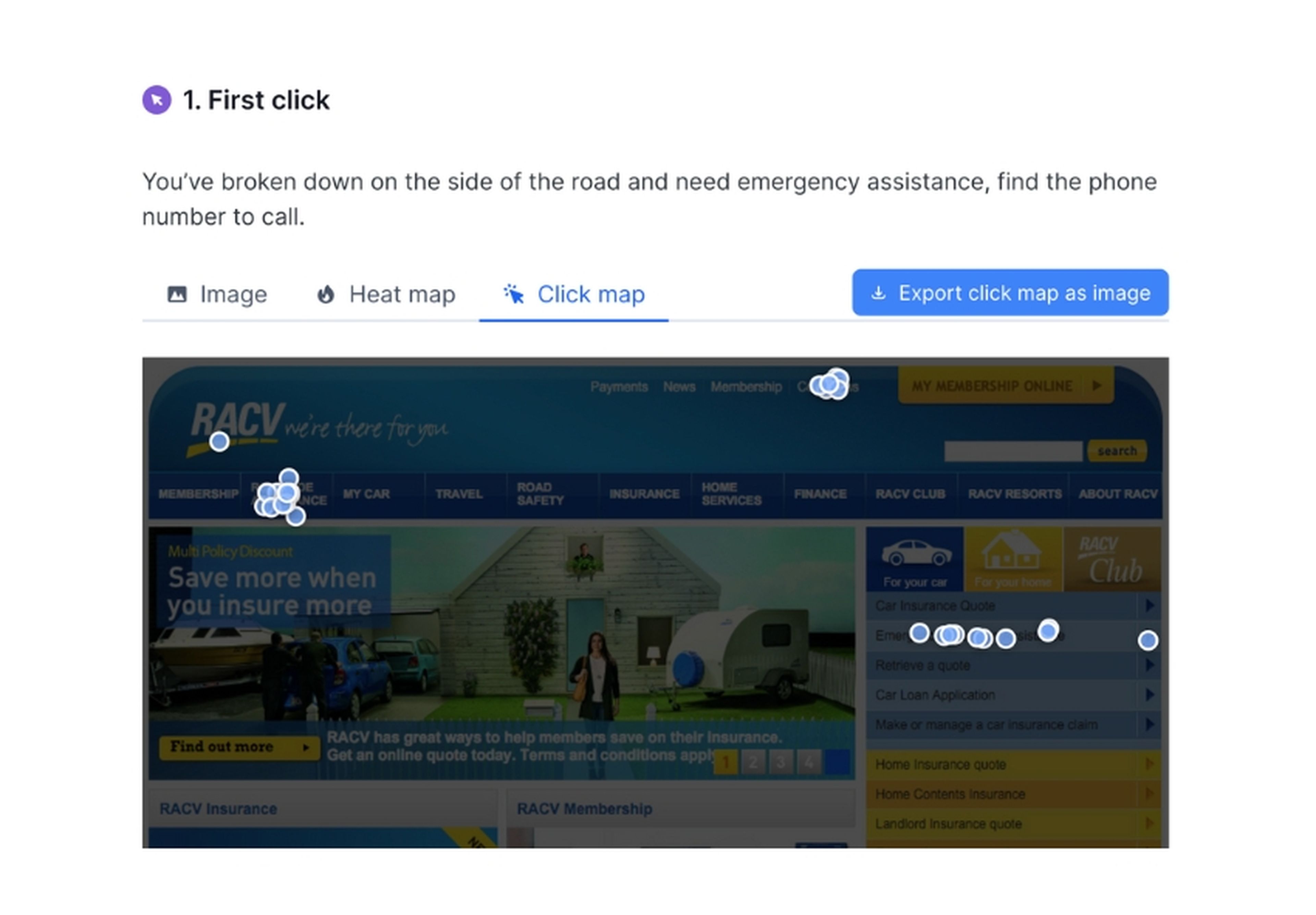
In fact, a follow-up question in the test also shows that 50% of users found it ‘Somewhat difficult’ to find the button.
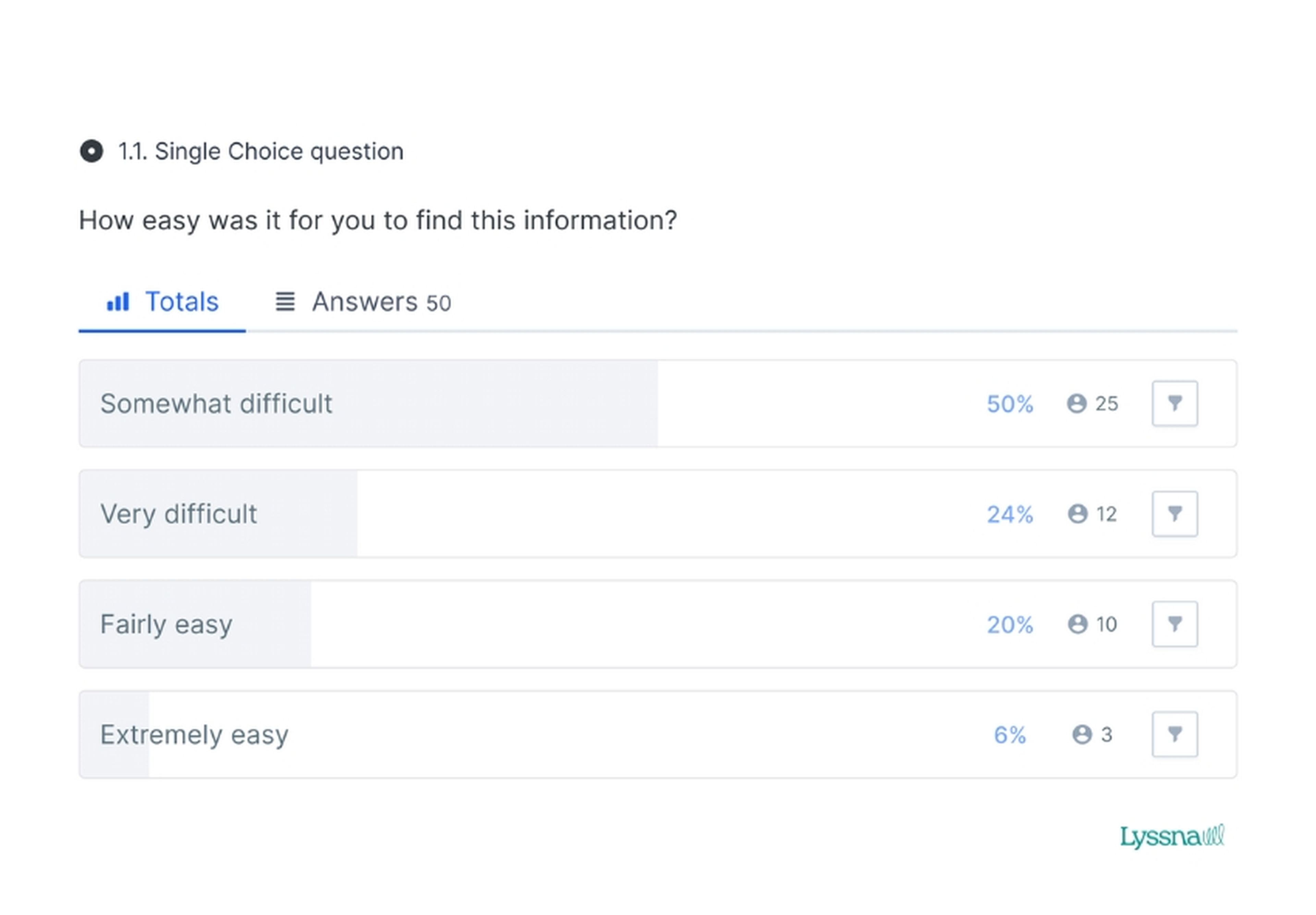
With this knowledge, you can now better the service placement on the page and, in turn, improve the discoverability for your customers.
Task completion time
This analysis metric provides insights into the efficiency and ease of user flows, allowing you to optimize user experiences. When running first click tests, the aim is to have users complete the task as quickly as possible, as it usually indicates fewer friction points.
To keep with the same example as above, it took participants an average of 29 seconds to complete the task. This can act as a benchmark for any future iterations and tests.
Design survey test results
Design surveys are great for gathering feedback on any type of design, whether it's an image, a video, or an audio file. With a design survey, you can choose from different question styles to gain deeper insights from your participants.
When viewing your design survey results in Lyssna, you have access to:
The average duration of completion
Raw response data
A word cloud
Plus, you can also tag participant responses to help organize and group similar answers.
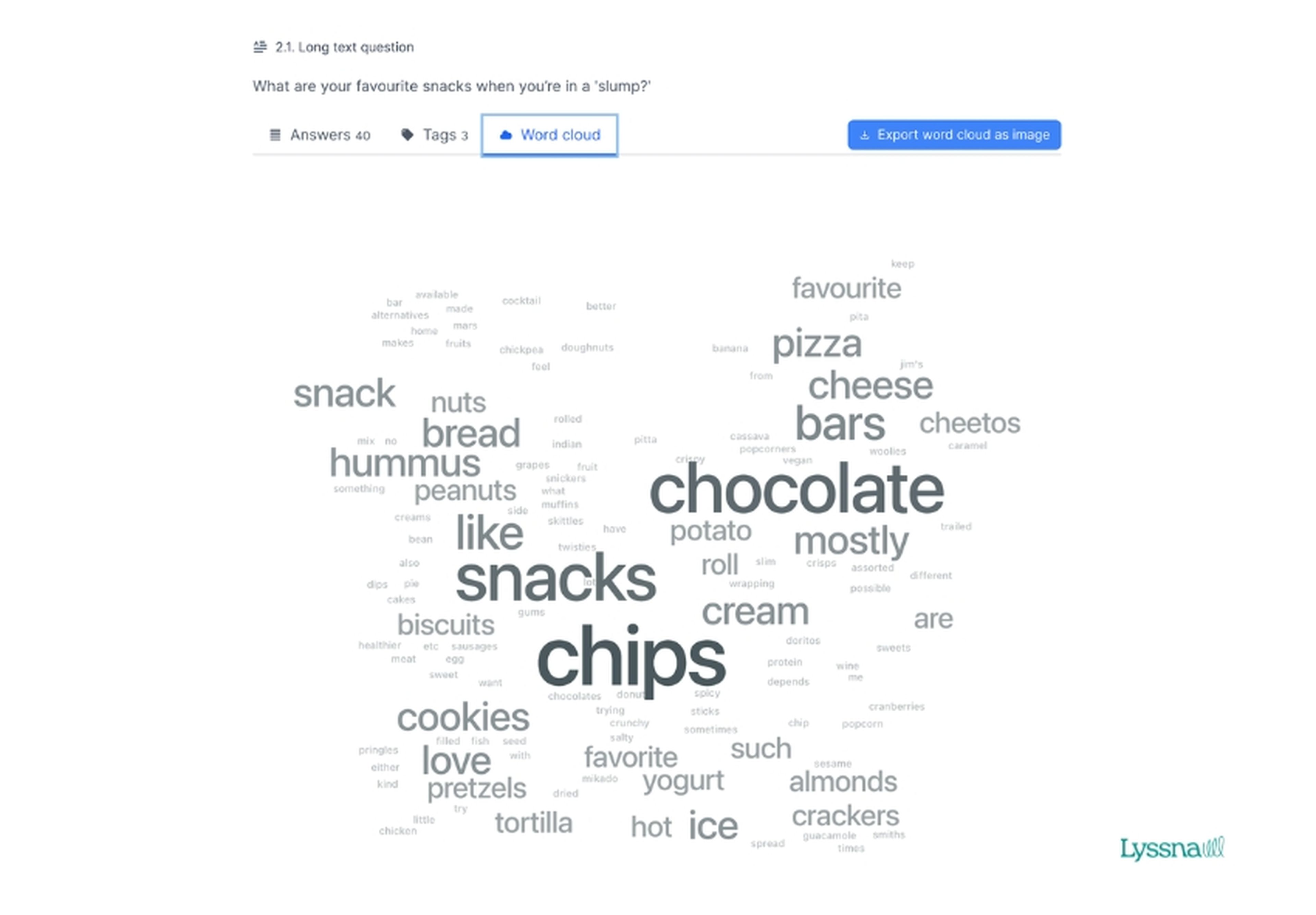
Word clouds
Word clouds provide a visual representation of frequently mentioned words or phrases in survey responses, with larger and bolder words indicating higher frequency. They serve as a valuable tool for identifying the key themes, sentiments, and priorities expressed by users.
For instance, imagine you work for a snack goods company and are conducting a market research survey to gather insights on your target audience's preferences during an afternoon slump.
Based on the image below, you can quickly discern the most popular snack items mentioned by participants, helping you understand their preferences and inform the development of a new snack product.
Text tagging
Text tagging allows you to categorize and analyze open-ended responses from survey results. It enables systematic organization, making it easier for you to extract valuable insights and identify any common trends.
Continuing from the previous example, while reviewing the responses to the question "What are your favorite snacks when you're in a 'slump'?", you can categorize the answers by tagging: unhealthy, chocolate, and healthy. By assigning tags, you provide additional context to the responses, enabling more insightful analysis and a deeper understanding of participants' snacking preferences in different situations.
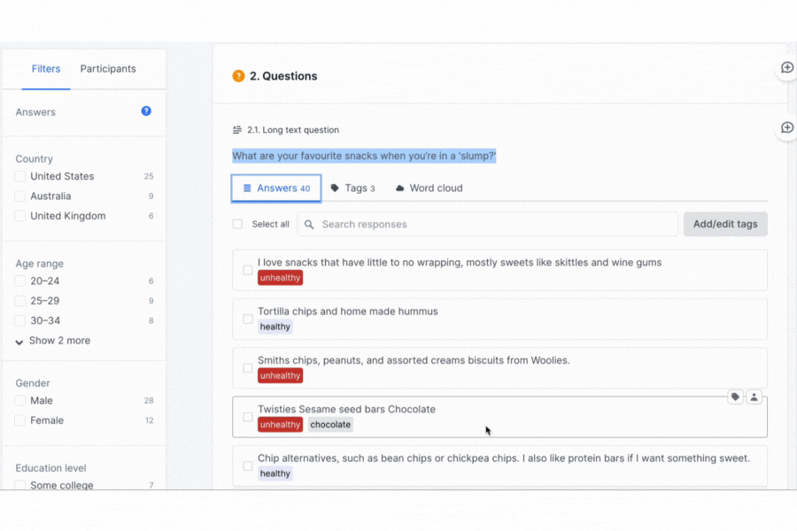
Lyssna analysis tool will then organize these tags, so you’re able to see what percentage of your target audience prefers a healthy, unhealthy, or chocolate snack.
Your go-to user research platform
The best teams use Lyssna so they can deeply understand their audience and move in the right direction — faster.

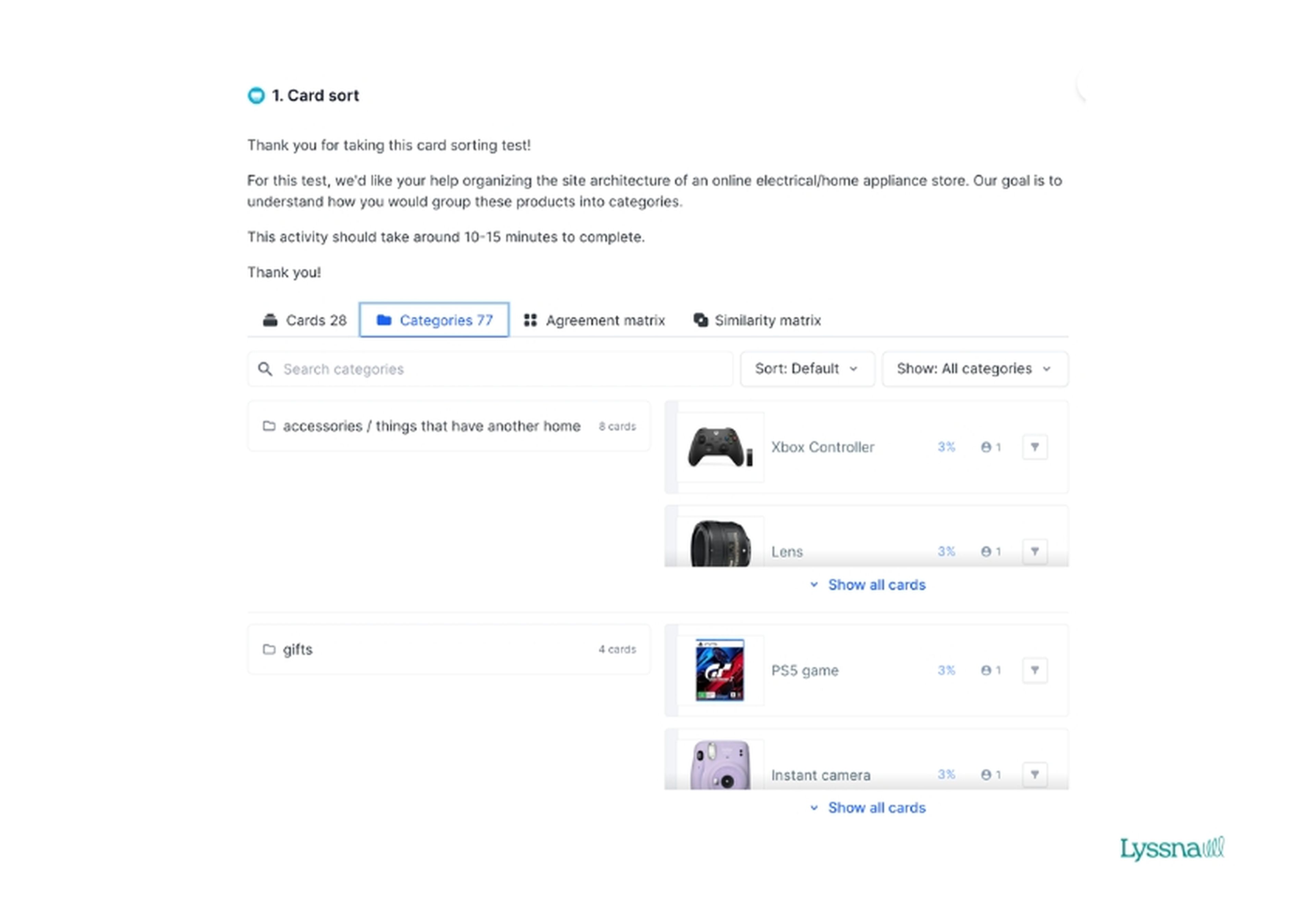
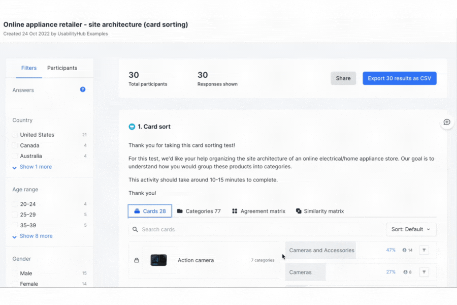
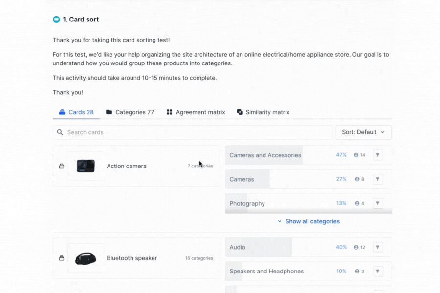
Analyzing card sorting results
Open and closed card sorting is a powerful way to understand the mental models of your users and see how they organize information. By leveraging the reports and analysis features – card analysis, category analysis, agreement matrix, and similarity matrix – you can gain actionable insights to optimize information architecture and improve user experiences. Let's take a look at how to analyze your card sorting results in more detail.
Card analysis
Card analysis involves examining the individual cards used in a card sorting test to identify trends and user preferences. It can help you gain insights into how your users categorize and prioritize information.
When looking at your results in your Lyssna dashboard, you’ll see the percentage of participants that sorted each card into a category and the number of participants that sorted each card into a category.
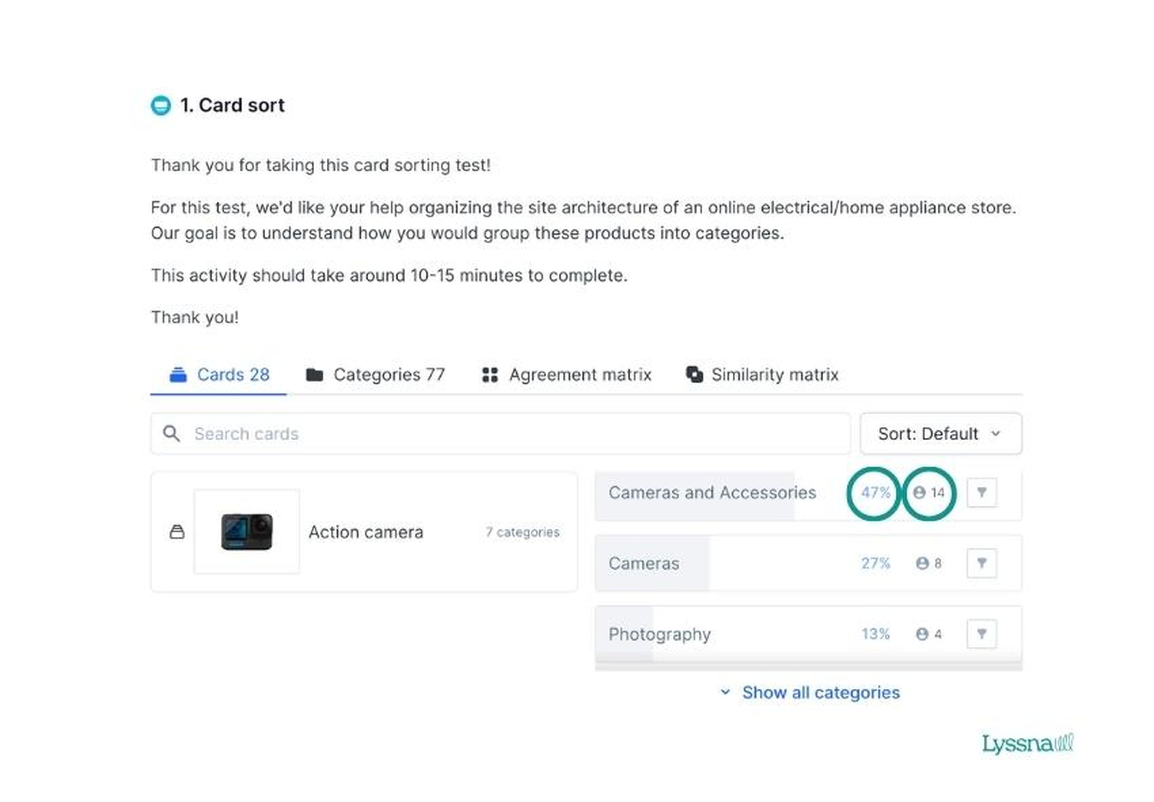
Pro tip: Card analysis is the default for viewing test results in Lyssna. This applies to both open and closed card sorts.
For example, say you conduct a card sorting test to improve product categorization on your ecommerce site. When reviewing the results, you notice that users consistently group electronics and appliances together, indicating a strong mental association.
This insight allows you to optimize navigation and improve the findability of your products, resulting in an enhanced user experience and increased conversion rates.
Category analysis
Category analysis involves examining the categories or groups that users create during an open card sorting test. It can help you understand user expectations and preferences for how to organize information.
In this view, you’ll be able to see each card sorted into a category, the percentage of participants that placed each card into the category, and the number of participants that placed each card into that category.
Let’s say you decide to conduct an open card sort to determine how users would categorize different travel destinations on your travel site. When reviewing the categories, you notice that users consistently group destinations based on factors such as geography, travel activities, and cultural experiences.
These insights allow you to restructure your destination pages, making it easier for users to navigate and explore relevant travel options.
Agreement matrix
The agreement matrix provides an overview of the level of agreement among participants regarding how they categorize cards. It’s a great way to review your results at a high level and identify areas of consensus and disagreement, and to facilitate decision-making.
The image below shows how an Agreement matrix looks in Lyssna. The left side of the matrix displays cards in rows, while categories are in columns. Each cell indicates the percentage of participants assigning cards to the categories. For additional information, hover over the cell. We use a deep blue shade to highlight the card with the highest agreement score automatically, while a light blue shade is used in case of a tie.
You can view in the example above where there’s been a high level of consensus among participants for certain topics, for example, categorizing the appliances, indicating a clear and intuitive categorization.
However, you can also see some disagreements in how to categorize the Bluetooth speaker: 10% believe it belongs under ‘speakers and headphones’, 40% under ‘Audio’, 7% under ‘Electronics’, 3% under ‘Computers and Accessories’, and 37% didn’t categorize it at all. This may lead you to reassess the organization and align it more closely with user expectations.
Similarity matrix
For open card sorts, you can use the similarity matrix to reveal the frequency at which card pairs are sorted into the same category, irrespective of which specific category they belong to.
The similarity matrix provides insights into the perceived relationships between cards during a card sorting test. This can help you understand user perceptions and how your users group information.
In Lyssna, the similarity matrix is organized to highlight clusters of cards that are frequently sorted together. We automatically emphasize pairs of cards with over 30% similarity in dark blue, while pairs with any level of similarity above 0% are highlighted in light blue. Cards with 0% similarity are left empty and displayed in gray.
The example above shows clear category clusters of certain products. For example, the first seven products all show dark blue shading, indicating high similarity scores. This insight points towards categorizing these products as a group to facilitate easier navigation and discovery for users.
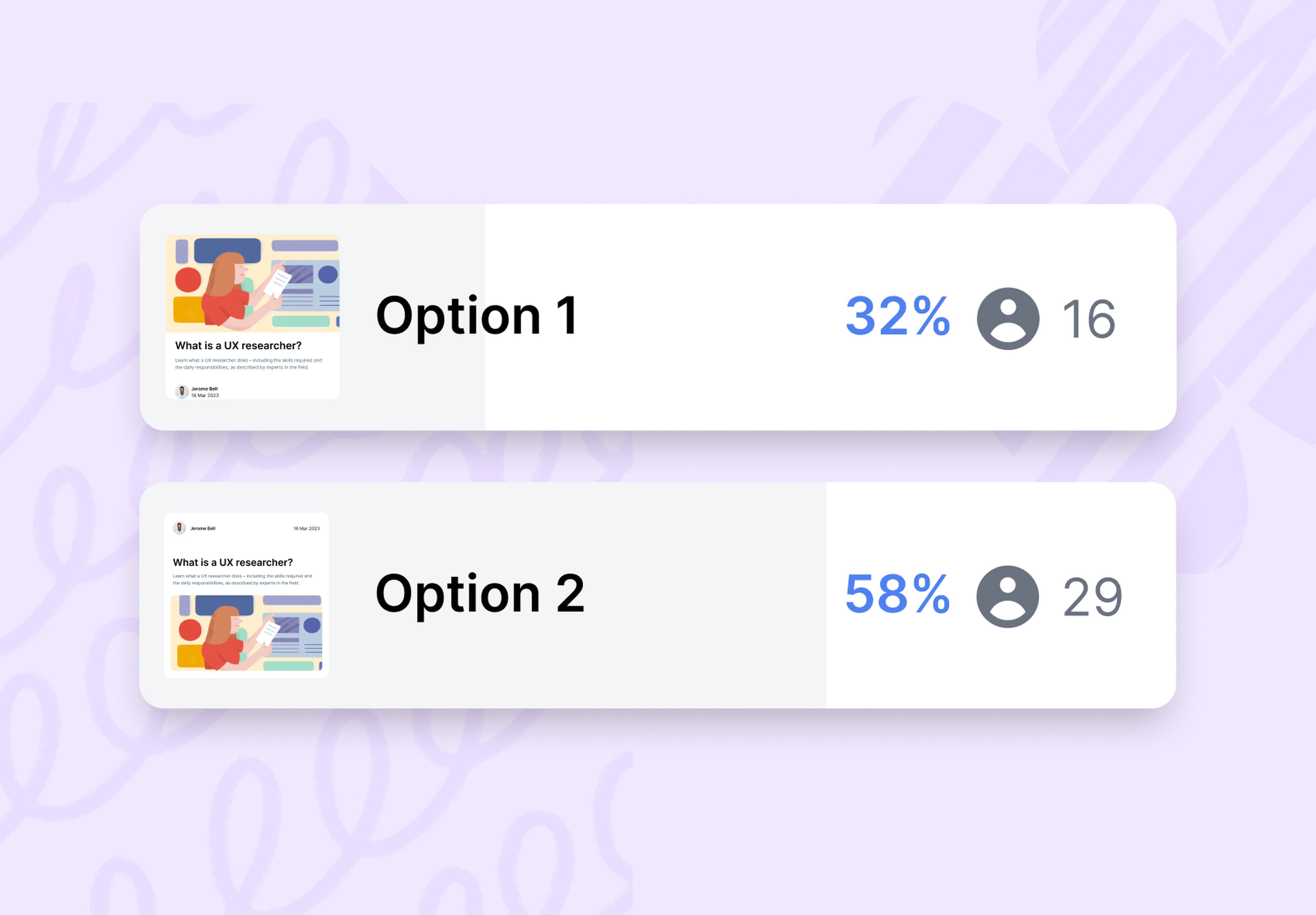
Preference test results
Preference tests serve as a valuable tool for decision-making between different design variations. Participants are presented with design variations and asked to make a choice based on their preferences or given criteria. The results provide insights into how popular each design option is among participants.
Statistical significance calculation
When viewing the results of your preference tests in Lyssna, you’ll notice the percentage of preference votes (shown in blue). We then go a step further by calculating the statistical significance of the winning design, displayed in a blue panel box just below the results.
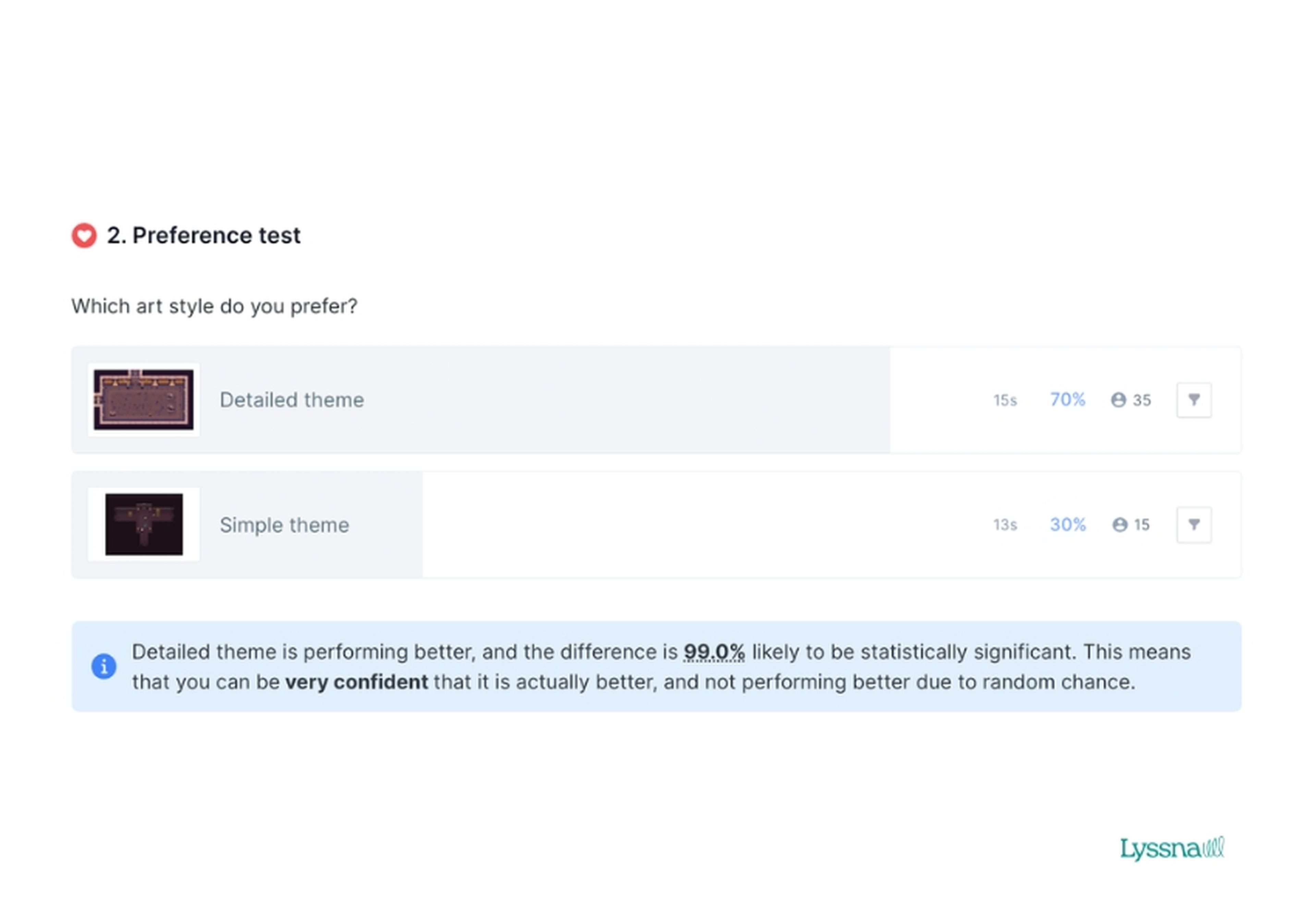
Currently, the statistical significance calculation feature is available only for preference tests with two design options. However, even without statistical confidence calculations, the preference test results can still offer valuable insights into which design your users prefer and guide your decision-making process.
Figma prototype test results
With prototype testing, you can import your design from Figma and invite participants to complete specific tasks or explore the prototype organically. This allows them to experience your designs intuitively, just like real users.
Prototype tests are particularly useful for testing complex designs with multiple navigation paths. By capturing and comparing interactions, you can identify common paths and potential areas of confusion, providing valuable insights for design improvements.
When creating your prototype test, you have two options: Task flow and Free flow. The choice depends on whether you want participants to freely explore the prototype or complete specific tasks. We will take you through the reports for both these flows.
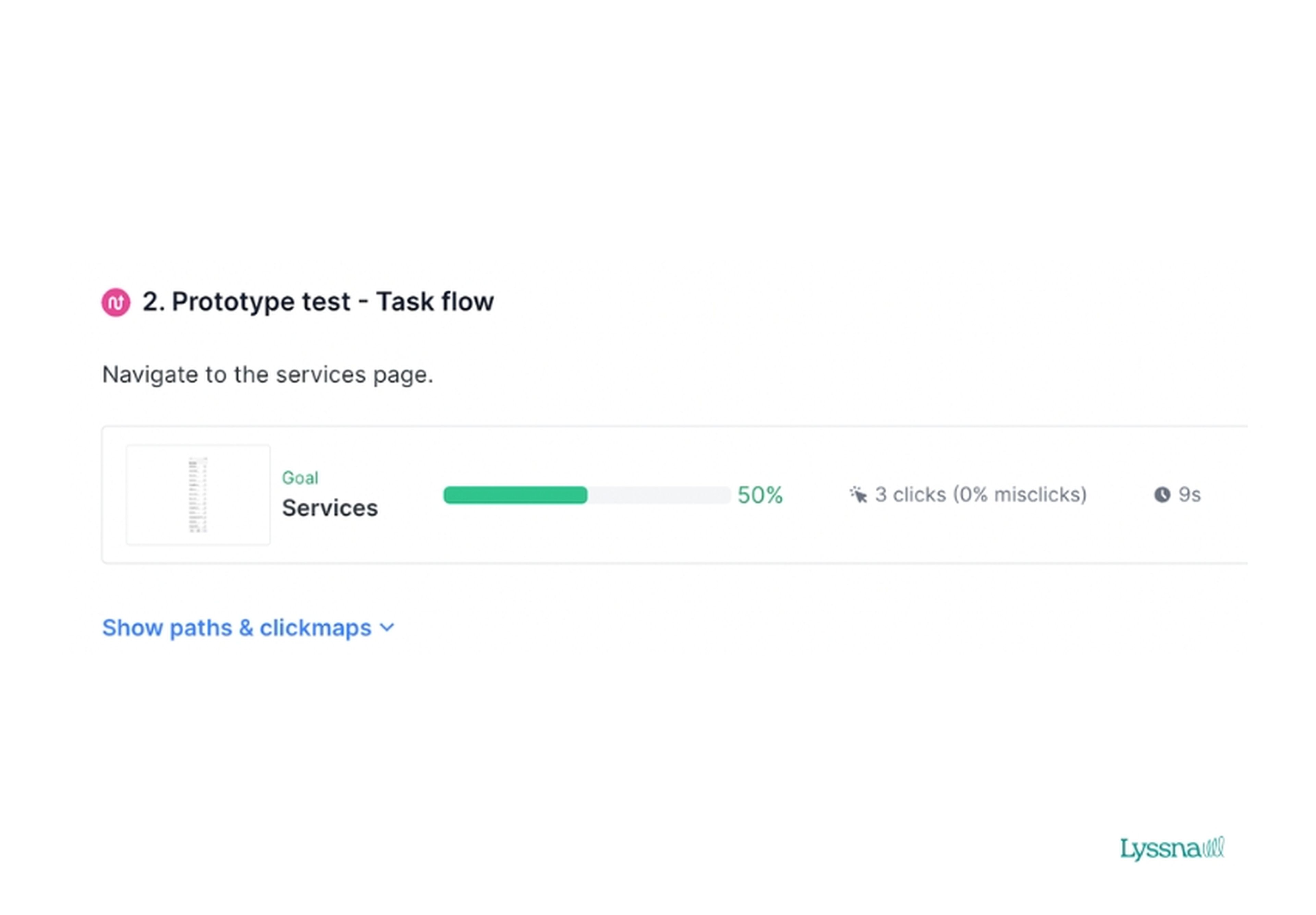
Task flow results
In task flow prototype tests, you ask participants to complete a task while navigating your prototype. When viewing your results in Lyssna, you’ll be able to see your goal screen, along with the following metrics for participants who reached the goal screen:
Percentage of participants that successfully reached the goal screen.
The average number of clicks (and how many were misclicks).
Average time to complete the task.
The exact number of participants that reached the goal screen.
Imagine you’re developing a mobile banking app and want to assess the user experience of a new fund transfer feature. You ask participants to transfer $100 from their savings account to a checking account using the fund transfer feature.
Through task flow analysis, you observe that some participants struggle to locate the fund transfer option or encounter difficulties inputting the transfer amount. These findings highlight areas for improvement, such as enhancing the visibility of the transfer feature and streamlining the input process, ultimately leading to a smoother user experience.
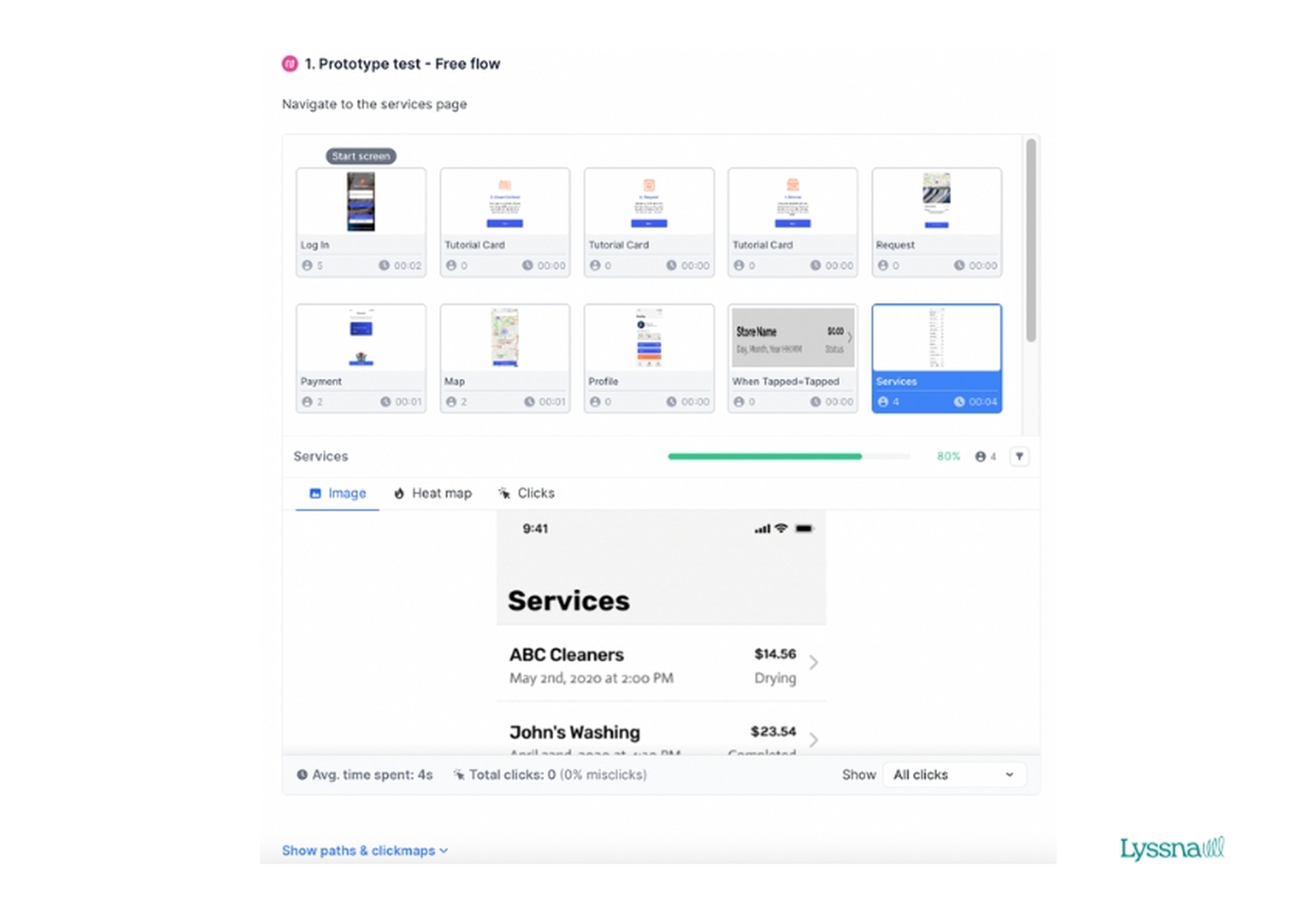
Free flow results
In certain scenarios, you may want to understand how users explore your prototype without a specific goal in mind. This is where the free flow option comes in handy. Participants can freely navigate the prototype, exploring its various features and interactions. Analyzing the free flow results, you can gain insights into users' impressions, identify standout elements, and discover unexpected usability challenges.
For free flow results in Lyssna, we display a grid containing thumbnails of all the screens within your prototype's flow. Within each thumbnail, we display:
An image of the screen.
The screen title (as set within Figma).
The number of participants that viewed that screen.
Average time spent on that screen by all participants.
Let's say you’re designing an ecommerce website and want to gather feedback on the overall user experience. In a prototype test with a free flow approach, you encourage participants to explore the website, browse products, and interact with various elements.
Analyzing the free flow results reveals that users consistently find the product filtering options confusing and struggle to locate the shopping cart icon. Armed with these insights, you can refine the filtering functionality and optimize the visibility of the shopping cart, improving the overall user experience of your ecommerce website.
By utilizing both task flow and free flow approaches in your prototype tests, you can gain comprehensive insights into how users engage with your designs. Task flow results provide targeted feedback on specific tasks, helping you fine-tune the usability and functionality of key features. On the other hand, free flow results provide a broader perspective on user impressions and unanticipated usability issues, guiding improvements across the entire user experience.
Unlock the potential of your research results
By harnessing these powerful features, you can extract actionable insights and maximize the benefits from your testing efforts. Get ready to explore the possibilities and discover how to make the most out of your tests with Lyssna's comprehensive suite of analysis tools.
Elevate your research practice
Join over 320,000+ marketers, designers, researchers, and product leaders who use Lyssna to make data-driven decisions.

You may also like these articles


Sign up to our newsletter
We'll keep you updated with the latest UX insights and more.