
This template is for:
Visual design
Design
Marketing
Surveys
Created by:
Lyssna
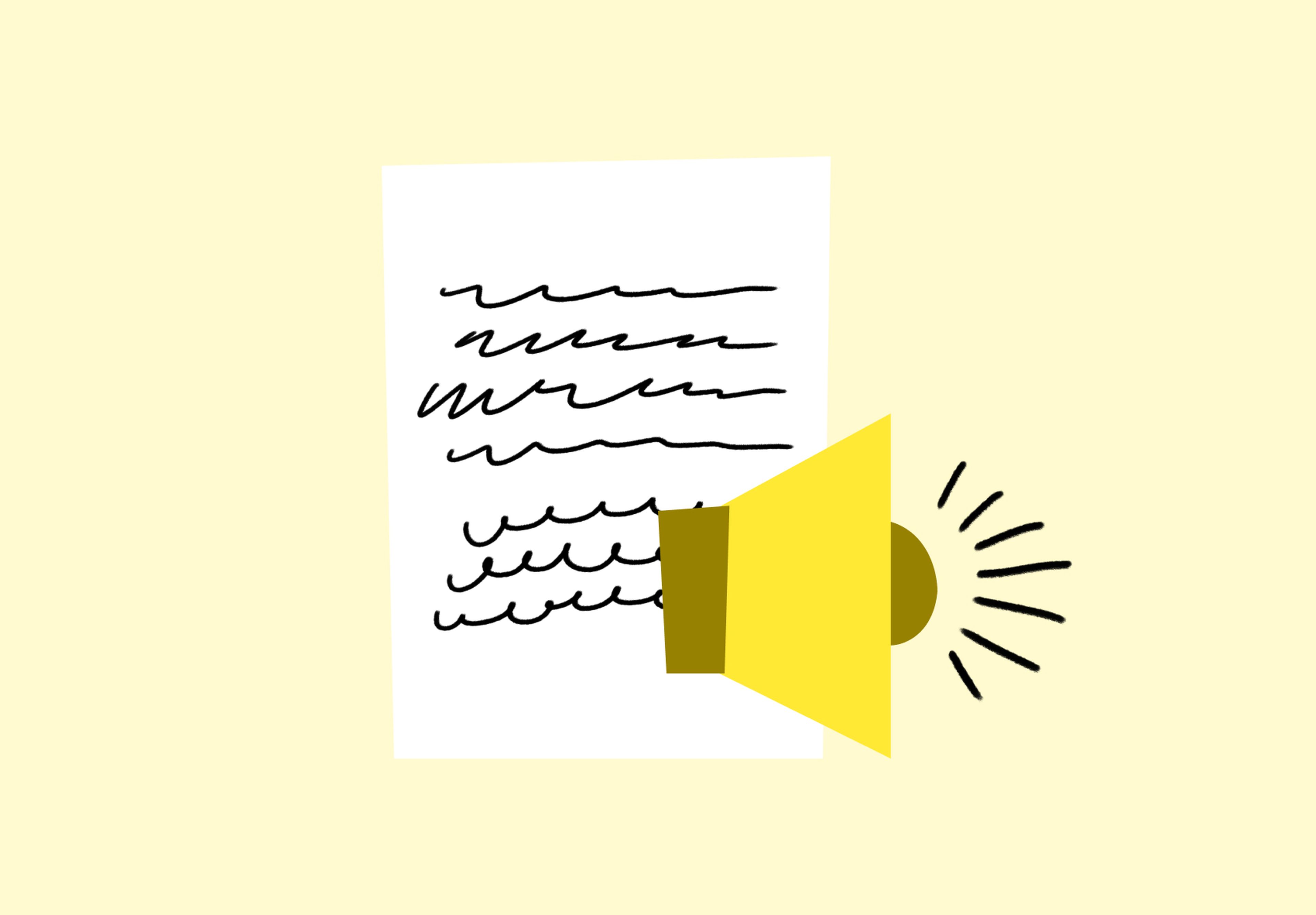
Overview
An interesting way to measure the visual appeal of your designs is to see how they make participants feel and what words they associate with it.
A simple way to test for this is by using the Microsoft Product Reaction Cards, named after a desirability study first developed by Microsoft in 2002.
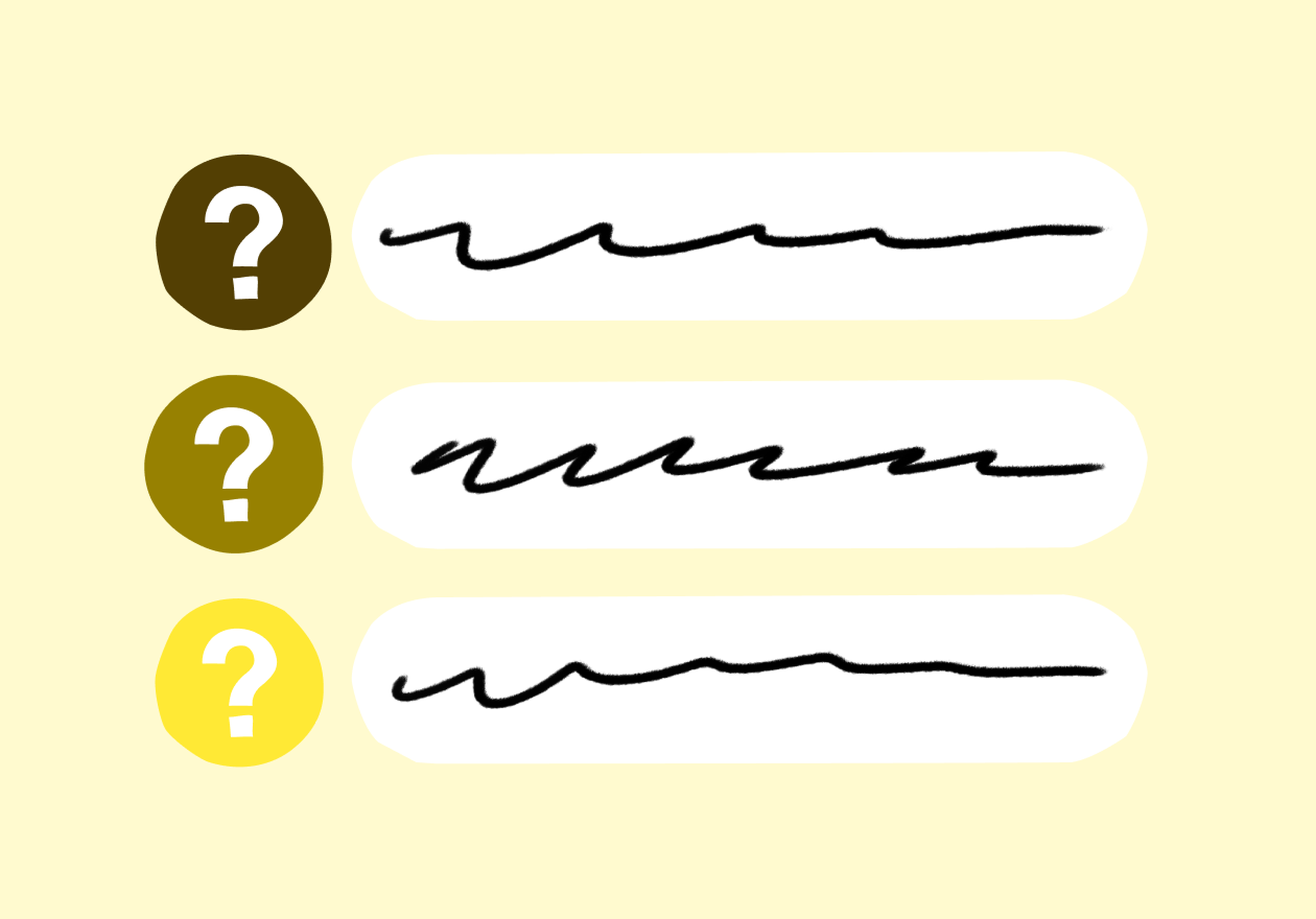
The method is simple: choose 15–25 relevant words from the full list and load them into a design survey question. Ask participants to look at your design next to the list of words, and to pick up to five words that best describe how they feel about the design.
The results will show the most popular words chosen by your participants. There’s little to no interpretation of the results required – if the most popular words align with your branding goals, then you’ve hit the mark!
Testing in this way can be useful when redesigning your branding. Running the same test with an older version of your branding can give you insight into how users interpret your new direction. In addition to branding, you can use this method to test UIs, copy, marketing images, and more. Just don’t forget to tailor your list of words to the asset that you’re testing.
This template will help you discover
How your designs make participants feel, providing insights into the emotional impact of your visuals.
Which words participants associate with your design, helping you understand the immediate impressions it creates.
Whether the chosen words align with your branding goals, so you can determine if your design effectively conveys your brand's intended message.
A comparative analysis with an older version of your branding, facilitating decision-making regarding design directions and branding strategies.
How to use this template
Click on the "Use this template" button and log in to your Lyssna account. Don't have an account yet? Start exploring with a free plan.
Modify the test to suit your needs.
Preview your test or press save and continue to recruit your participants.
Set your test live and wait for your results!
Frequently asked questions
You may also like these templates

Marketing
“We use Lyssna tests to help us make decisions for various projects. From web and mobile design to marketing activities.”
Luther Lowe,
VP Public Policy & Gov. Affairs at Yelp


Try for free today
Join over 320,000+ marketers, designers, researchers, and product leaders who use Lyssna to make data-driven decisions.
No credit card required