19 Apr 2024
|10 min
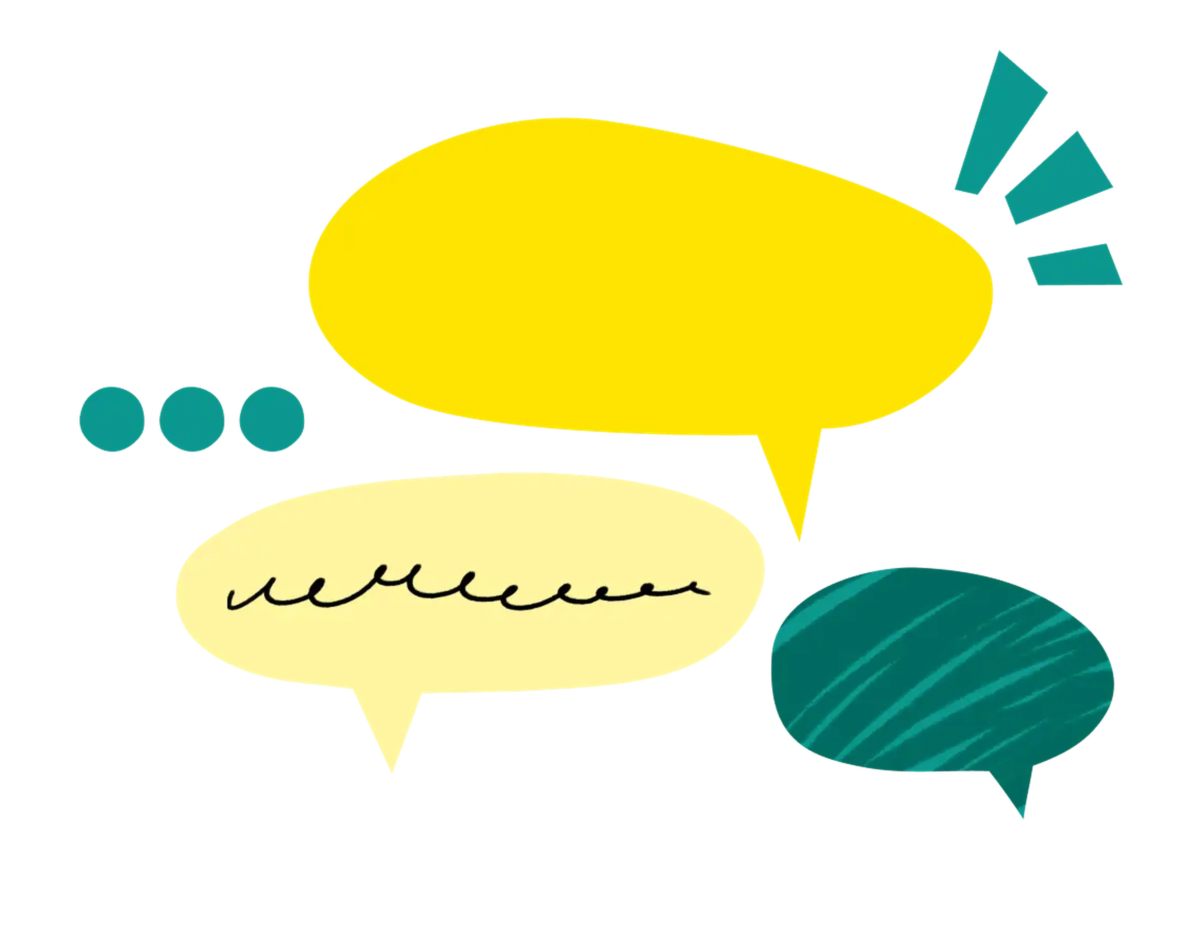
Affinity mapping
Learn how affinity mapping can help you turn complex research data into meaningful insights and actionable solutions.


If you're a UX designer or researcher, you know that gathering user feedback is an essential part of the product development process. But how do you make sense of all the data you collect? That's where affinity mapping comes in.
Affinity mapping is a technique that helps you organize and make sense of research data. More than that, though, it can be useful for people in any discipline looking to brainstorm, while still creating order and clear action items.
Let’s take a closer look at what affinity mapping is, how to do it, and why it's useful in research.

What is affinity mapping?
Affinity mapping is a visual technique used to organize ideas and data into meaningful clusters or categories. Also known as affinity diagramming, it was first developed in the 1960s by Jiro Kawakita, a Japanese anthropologist, to study water supply challenges in Nepal. (In fact, it was initially known as the “KJ method”, after his initials.) Looking at the vast array of ethnographic data he had collected, he realized that the spatial arrangement of the research provided meaning and context. The methodology went on to be adapted more broadly in Japan over the following decades, and became a cornerstone of design thinking and the emerging field of UX research in the ‘80s and ‘90s.
While Kawakita’s use case was specific, the method has proven adaptable to a wide variety of problems, and is well-suited to digital and remote tools. The general idea is to group together similar ideas or concepts, which can help identify patterns, themes, and findings. For researchers, this process can help understand user needs, pain points, and preferences, which in turn can inform design decisions.
How to create an affinity map

Let’s start by diving into the process itself. Here are the steps to create an affinity map.
1. Identify the problem or topic
Start by identifying the problem or topic you want to explore. This might be a user pain point, a design challenge, or a research question.
2. Collect findings
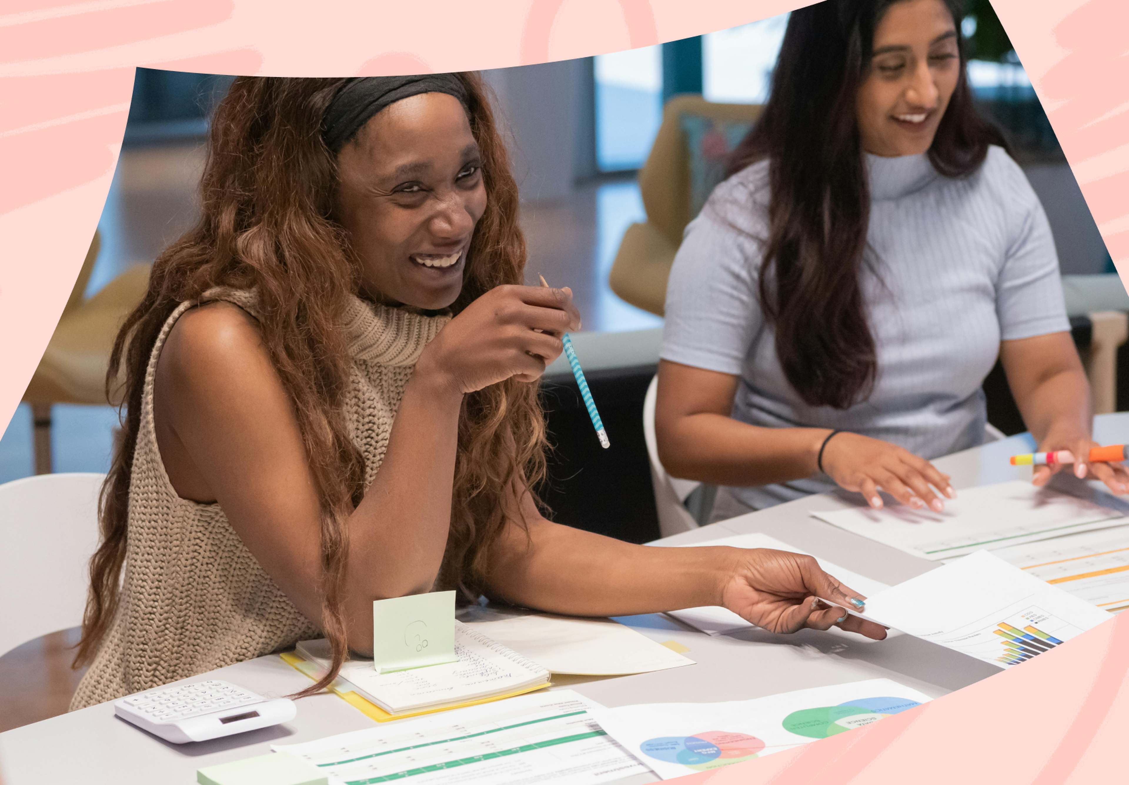
Next, you’ll want to collect findings from users or team members about the given topic or problem. You might be asking a wide field of users about their experience with a new layout configuration, or working with a small team of stakeholders to figure out next steps in a project. Traditionally, each idea was written down on a sticky note or index card, although modern digital tools can recreate this process for remote teams. Normal brainstorming practices apply here, but encourage lots of ideas.
3. Categorize
Once you have all of your ideas written down, start grouping them together based on their similarities. Look for patterns and themes in your ideas.
4. Name the categories
Give each group a name that captures the ideas within it. Try to be concise and specific. Small groups may have enough similarities that they can be clustered together, and big groups can be broken up. Talk this through as a team, but don’t overthink it.
5. Identify insights
Step back and look at your affinity map. What patterns or themes emerge? What insights can you draw from your research data? You may uncover new user needs, design opportunities, or research gaps. Perhaps you’ll find that many stakeholders are circling a central concept that should be discussed further.
6. Plan next steps
If you’re attempting to create action items, this is a place where voting on next steps is a possibility. In other situations, consensus isn’t as appropriate, and you may just want to synthesize your findings to present to a broader team.
7. Iterate
As with any aspect of the design process, iteration can be useful. Maybe categories need to be renamed or a conversation reveals a new prompt for brainstorming. Head back up to an earlier step if necessary to refine the results even further.
Why should you use an affinity map?
Affinity maps are a remarkably versatile tool, and can even be used individually to help sort through a sticky problem. For UX researchers, they help in a few key ways, outlined below.
Understanding user needs
This includes pain points, which can in turn inform design decisions. For example, perhaps you collected feedback from users on a new app design and they said that it was difficult to make a purchase. This may mean that the design isn't sufficiently clear to them.
Understanding user feedback
This includes survey responses or usability testing data. Say you work for an education app and there's a large group of users who rarely or never open the app. After asking them why, you could use an affinity map to help make sense of this large dataset.
Fostering collaboration with stakeholders
Design is a collaborative process and often involves working with stakeholders from other departments. An affinity map can incorporate input from multiple teams into a single session. It’s a useful medium to get people to talk through different perspectives.
Communicating findings
Distill complex findings into a simple, visual format, which can then be presented more compellingly. It’s hard to argue with the visual power of a zillion blue Post-it notes.
Let’s run through a hypothetical example. Imagine you’re conducting UX research for a digital health platform aimed at older adults. You’ve conducted interviews and surveys and have collected a lot of data. Affinity mapping can be useful to organize and make sense of this data. You can use this method to categorize user needs and preferences, such as medication management, tracking vitals, scheduling appointments, and reminders. By doing so, you can identify patterns in the data and prioritize features that are most important to your users. Moreover, you’ll have a record of these patterns that’s systematic and visual.
Tips for successful affinity maps
As with any brainstorming process, creating an affinity map can be very different from team to team and situation to situation. The particular dynamics of an individual group and the feasibility of resultant action items have to be considered. You don’t want to accidentally greenlight a solution that will never happen.
Still, a few tips are useful across scenarios.

Encourage participation
Affinity mapping is most effective when done as a group, so make sure everyone feels comfortable contributing their ideas. If someone is being quiet, there may be a reason. One solution could be to set a quota for ideas contributed per person in the “collect insights” phase.
Involve stakeholders
When relevant, make sure that key stakeholders are involved. Affinity maps can create clear action items in a compelling visual manner. They create a consensus that’s logical to buy into.
Keep it simple
Don't overcomplicate the process. Focus on identifying key themes and patterns, and avoid getting bogged down in too much detail. When sorting, “good enough” can be good enough. It can be helpful to think of affinity maps as a way to “break ground” on a complex conversation or difficult dataset.
Set a time limit
Affinity mapping can be a time-consuming process, so set a limit to keep everyone focused and productive. If you have an hour and are running the whole process in a room, spend 15 minutes generating ideas on post-it notes, 15 minutes sorting them, and 15 minutes talking through them, with the remaining 15 minutes as a buffer. This math would shake out a little differently if you’re using an affinity map to sort through survey responses or user data, but the principle remains: set time limits to avoid getting stuck.
Use color and visuals
Adding color and visuals to your affinity map can help to make patterns and themes more apparent and memorable.
Best tools for affinity mapping
While there are a lot of pluses to sitting in a room with your team and picking each other’s brains in real-time, digital platforms have made remote collaboration a breeze.
Here are a few options with affinity mapping utilities.
Miro

Miro is a digital whiteboard platform that allows teams to collaborate and ideate in real-time. It has a colorful and well-designed template for affinity mapping, as well as its own how-to guide.
InVision

InVision is a prototyping and design tool that also has a built-in affinity mapping feature. It allows teams to create and share affinity maps within the same platform they use for designing and prototyping.
Figma

Figma is a collaborative interface design tool. It also has a solid affinity mapping template designed by community user UX Anudeep.
Lucidchart

Lucidchart focuses on creating clean, presentable diagrams, but it also has a strong affinity mapping capability. Its end results will be particularly presentation-ready.
If you’re able to meet in person, the only tool you need for an effective affinity map is as many post-it notes as your team has ideas. Happy categorizing!
Your go-to user research platform
The best teams use Lyssna so they can deeply understand their audience and move in the right direction — faster.
Frequently asked questions about affinity mapping
You may also like these articles


Sign up to our newsletter
We'll keep you updated with the latest UX insights and more.